📷 Image source: AntiqueBanknotes.com. Images are selected by AI to represent the article topic and may not depict the exact note(s) described.
Pick up any Federal Reserve Note printed before 1969 and hold it under a good loupe. Look at the circular seal on the left side of the face. If you know what you are looking for, that ring of text will tell you not just which of the twelve Federal Reserve Banks issued the note, but roughly when it was printed, which plate generation produced it, and sometimes even which printing technology was in use at the Bureau of Engraving and Printing. The typography of the Federal Reserve seal is one of the most underappreciated fields in American paper money collecting, and this article is an attempt to do it proper justice.
The Birth of the Seal: 1914 and the Problem of Twelve Banks
When Congress passed the Federal Reserve Act on December 23, 1913, it created a structural challenge that the Bureau of Engraving and Printing had never faced before: a single currency system that needed to distinguish notes from twelve geographically distinct issuing institutions while still looking like a unified national currency. The solution was the circular district seal, a design element borrowed loosely from corporate and governmental seal traditions already common on bonds and certificates of the era.
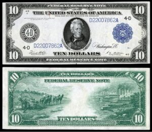
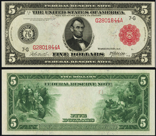
The Series 1914 notes, both the Red Seal and Blue Seal varieties, featured a seal whose lettering can best be described as condensed Gothic, sometimes called “bank Gothic” in period printing trade literature. The letterforms were upright, with relatively high stroke contrast between thick and thin elements, and the spacing between characters was tight enough that on lower-denomination notes printed with slightly worn plates, individual letters in district names like “MINNEAPOLIS” or “SAN FRANCISCO” could begin to fill in and merge. Collectors today grade these early examples carefully for exactly this reason: a well-struck 1914 Blue Seal $10 from the San Francisco district (L) with clean, open letterforms in the seal text commands a significant premium over a mushy strike of identical technical grade.
When evaluating Series 1914 Federal Reserve Notes, examine the district seal text under 5x magnification before committing to a grade or price. Notes from Kansas City (J) and Dallas (K) with crisp, fully separated letterforms in the seal inscription are considerably scarcer than their print run figures alone suggest, because worn plates produced legibility problems throughout both districts’ print runs.
Large-Size to Small-Size: What Changed and What Did Not (1928)
The transition to small-size currency in 1928 forced a complete redesign of every engraved element on Federal Reserve Notes, and the district seal was no exception. Working within a note that had shrunk from roughly 7.42 by 3.13 inches to the modern 6.14 by 2.61 inches, BEP engravers had to compress the seal without destroying its legibility or its visual authority on the face of the note.
The solution in the Series 1928 design was to reduce the letterforms to a slightly lighter weight while also opening up the inter-character spacing fractionally. This was a counterintuitive choice: when you reduce the overall diameter of a circular text element, conventional typographic wisdom says you should also reduce spacing to maintain proportion. The BEP engravers went the other direction, and the result is that well-struck 1928 series seals actually read more cleanly than many of their 1914 predecessors despite being physically smaller. The stroke weight on the 1928 design is noticeably thinner when you compare it directly to a 1914 note side by side, a useful authentication check when examining notes of uncertain vintage.
One often overlooked detail: the Series 1928 through 1934-D notes used a serif-inflected letterform for the district name text that retained a vestigial bracketing at the terminal strokes. This is not a full serif in the classical sense, but a subtle flaring that is most visible on the letters “F,” “L,” and “I” in district names. Starting with Series 1950, this vestigial flaring was smoothed away entirely, giving the seal text a more purely geometric appearance that aligns with the broader mid-century modernization of BEP design sensibility.
The easiest way to distinguish a Series 1934 seal from a Series 1950 seal without reading the series date is to look at the capital “F” in “FEDERAL RESERVE” within the seal text. On 1934 and earlier, the arm terminals show slight flaring. On 1950 and later, the terminals are cut cleanly with no flare. This detail survives even on circulated notes in Fine condition.
The 1950 Redesign: Modernism Comes to the Seal
Series 1950 represents the most significant typographic revision to the Federal Reserve seal between its 1914 introduction and its 1969 elimination. The redesign was part of a broader effort to modernize the aesthetic of American currency, the same effort that adjusted vignette borders and refined the Treasury seal concurrently. For the district seal specifically, three changes are documentable from plate examination and BEP records.
First, the overall weight of the letterforms was increased slightly relative to the 1934-D designs, creating a bolder, more authoritative ring of text. Second, the inter-character spacing was standardized more rigorously across all twelve district names, meaning the visual rhythm of the seal text is more consistent on 1950 notes than on earlier issues where district names of different lengths were accommodated somewhat unevenly. Third, and most subtly, the inner and outer ruling lines that frame the text ring were adjusted in relative weight: the outer rule became heavier and the inner rule lighter, creating a visual hierarchy that draws the eye inward toward the district letter at the seal’s center.
Districts with longer names continued to present compositional challenges. “SAN FRANCISCO” and “MINNEAPOLIS” had to pack twelve and eleven characters respectively into the same arc length that “BOSTON” filled with six. Collectors examining these districts’ notes from the 1950 series will notice that the letterspacing on San Francisco (L) seals is noticeably tighter than on Boston (A) seals from the same series year. This is not a defect; it is an intentional accommodation, but it does affect readability and can affect eye appeal in high-grade examples.
Districts That Printed the Longest: Survival Rates and What They Mean for Collectors
Not every Federal Reserve district printed notes continuously and in equal volume throughout the 1914 to 1969 era. Understanding which districts printed the most aggressively, and for the longest uninterrupted runs, matters to collectors because it directly affects the relative availability of seal typography examples across the full evolutionary arc.
The New York district (B) was by far the dominant printing volume throughout the entire period, issuing notes in virtually every series and denomination combination with rarely interrupted continuity. For a collector trying to assemble a typographic progression of the Federal Reserve seal from 1914 through 1969 using New York notes, the task is difficult primarily because of cost, not scarcity: well-struck examples exist for nearly every series. The seal typography evolution is therefore most clearly and affordably studied on New York notes.
Richmond (E) and Chicago (G) also maintained very long and relatively unbroken printing histories, with both districts producing substantial runs in the difficult-to-find large-size series as well as throughout the small-size era. San Francisco (L) is remarkable for the consistency with which its notes appear across series years, which many historians attribute to the West Coast’s robust commercial banking demand, particularly after World War II defense spending transformed the region’s economy.
By contrast, Minneapolis (I) and Kansas City (J) show more interrupted patterns. Minneapolis in particular is notable for its relatively low print volumes in several small-size series from the late 1930s through the mid-1940s, reflecting the economic demographics of its agricultural district during the Depression and war years. For collectors, this means that the 1935 through 1945 typographic variants of the Minneapolis seal are genuinely difficult to find in collector-worthy grades.
If you want to build a complete “seal typography evolution” type set without spending a fortune on large-size rarities, consider anchoring the collection on New York (B) and Chicago (G) district notes for the common series years, then selectively acquiring Minneapolis (I) and Atlanta (F) examples only for the series where those districts’ typography shows genuine variation from the New York standard. This hybrid approach keeps the collection educational without requiring a five-figure budget for the complete 12-district set in each series.
The Final Chapter: 1963 to 1969 and the Seal’s Elimination
By the early 1960s, the Federal Reserve seal as a complex circular typographic element was already living on borrowed time. The Series 1963 notes retained the seal in its then-current form, but internal BEP discussions documented in Treasury Department records from that period reflect growing sentiment that the seal was both typographically dated and mechanically inefficient to reproduce consistently at the volumes that modern currency production demanded.
The Series 1963-A notes, issued beginning in 1965, were the last to carry the full circular Federal Reserve district seal in its traditional form on all denominations. The Series 1969 notes, authorized under the redesign directives formalized in 1968, replaced the circular district seal with an open black district letter printed separately, surrounded by a simplified circular border that was far less typographically complex than its predecessor. The district name was relocated to text printed elsewhere on the note face, ending fifty-five years of seal typography evolution.
For collectors, this means the Series 1963-A notes in pristine uncirculated condition represent the final flowering of the seal’s typographic tradition, and gem examples, particularly from lower-volume districts, carry a sentimental as well as numismatic premium that the raw population reports do not always capture.
| Series / Date | District or Variety | Approx. Print Volume | Rarity |
|---|---|---|---|
| 1914 Red Seal | All Districts (early strike, sharp seal text) | Limited initial run | Key Date |
| 1914 Blue Seal | Minneapolis (I), $5 | Approx. 1.1 million | Rare |
| 1914 Blue Seal | New York (B), $10 | Multi-million run | Scarce |
| 1928 | Dallas (K), $20 | Approx. 636,000 | Rare |
| 1934-A | Minneapolis (I), $50 | Approx. 210,000 | Key Date |
| 1934-D | Chicago (G), $5 | Approx. 7.2 million | Common |
| 1950-B | San Francisco (L), $100 | Approx. 2.16 million | Scarce |
| 1950-E | Richmond (E), $10 | Approx. 5.4 million | Common |
| 1963-A | Kansas City (J), $2 (last seal series) | Approx. 560,000 | Rare |
| 1963-A | New York (B), $1 | Hundreds of millions | Common |
Conclusion: A Fifty-Five Year Story Worth Reading
The evolution of the Federal Reserve seal from the heavy Gothic lettering of the 1914 Red Seals to the clean, modernized text of the final 1963-A series is one of the most coherent visual narratives in American numismatics, and it is hiding in plain sight on notes that many collectors pass over daily. Understanding the letterform weights, the inter-character spacing accommodations, the 1950 modernization, and the district-by-district printing histories transforms every pre-1969 Federal Reserve Note from a simple piece of paper money into a document of typographic and institutional history.
Start with a New York $1 from each series year to trace the evolution cheaply and clearly, then branch out to the challenging districts: Minneapolis for scarcity, San Francisco for the letterspacing compromises demanded by that long district name, and Dallas or Kansas City for the genuine rarities that reward patient searching. The seal will repay every minute of attention you give it.