Pick up a $1 Federal Reserve Note from your wallet and compare it to a photograph of an 1861 $5 Demand Note. Beyond the obvious differences in design and security features, one transformation leaps out immediately: the lettering. The dense, flourished blackletter of the early greenbacks has given way to the restrained, engineered precision of modern currency typography. That evolution did not happen overnight, and it did not happen by accident. Every typeface change, every serif adjustment, every shift in numeral style on United States currency reflects a deliberate decision rooted in engraving technology, counterfeiting prevention, political symbolism, or simple modernization. For collectors, understanding typographic history unlocks a rich layer of variety hunting that many hobbyists overlook entirely.
The Engraver’s Art: Setting the Stage in 1861
When Salmon P. Chase, Lincoln’s Treasury Secretary, authorized the first Demand Notes in 1861, there was no Bureau of Engraving and Printing yet. The notes were produced under contract by the American Bank Note Company and National Bank Note Company, two private firms that brought their own design traditions. The lettering on these notes, Friedberg numbers FR-1 through FR-8, was executed entirely by hand-engraving on steel dies. Engravers working in this tradition had spent decades producing commercial bank notes, stock certificates, and bonds, and they carried those conventions directly onto federal currency.
The dominant style was a hybrid of Old English blackletter for certain headings, Roman serif capitals for denomination text, and ornate script for phrases like “The United States” across the top of the note. The numeral style used on 1861 Demand Notes closely resembles what typeface historians call “clarendon” slab-serif display type, popular in American commercial printing from the 1850s onward. Bold, slightly condensed, with heavy bracketed serifs, these numerals were chosen because they were difficult to alter with a penknife, a common counterfeiting method of the era.
When examining 1861 Demand Notes, use a loupe to study the quality of the engraved lettering on “FIVE DOLLARS” versus the typeset serial number. The denomination text was die-engraved while serial numbers were overprinted using movable type, creating a visible difference in ink depth and crispness that authenticators use to spot alterations.
Legal Tender Notes and the Greenback Era: 1862 to 1880
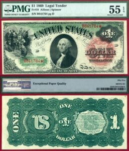
The Legal Tender Notes introduced in 1862 (FR-16 onward) brought a more standardized typographic palette under the newly established Currency Bureau, which became the Bureau of Engraving and Printing by 1877. The title text “United States Note” appeared for the first time in a large-cap Roman serif face that would anchor federal currency design for the next three decades. The letterforms on these notes were engraved by a small cadre of elite craftsmen, most notably Alfred Jones, Charles Burt, and James Smillie, whose individual styles can sometimes be distinguished by serious specialists.
The Series 1869 “Rainbow” Legal Tender Notes (FR-27 for the $1, running through FR-184 for the $1,000) represent a high watermark of 19th-century currency typography. The denomination text on these notes uses a condensed titling Roman with extraordinarily fine hairlines between thick strokes, a ratio that the BEP’s master engravers could achieve on steel but that printing technology of the era made almost impossible to reproduce by photographic counterfeiting. Collectors grading these notes at Fine-12 or better can observe the complete letterform detail; worn examples at Good-4 show the hairlines collapsing, which is actually a useful authenticity indicator since period counterfeits often filled in those thin strokes.
The Series 1875 and 1878 Legal Tender Notes introduced subtle but important typographic changes to the serial number style. Earlier overprints used a slightly condensed gothic numeral; the 1875 series shifted to a more upright, wider gothic that is visible under magnification. This change was driven by a new overprinting press acquired from a German manufacturer, which had different type furniture. This variety is documented in Friedberg but rarely discussed separately in price guides, making it one of those low-cost typographic curiosities that sharp-eyed collectors can build a specialized exhibit around.
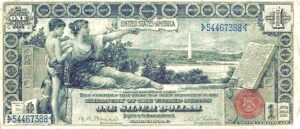
Silver Certificates and the Victorian Typographic Apex: 1878 to 1896
Silver Certificates, authorized by the Bland-Allison Act of 1878, brought an entirely new typographic vocabulary to US currency. The Series 1878 and 1880 large-size certificates used elongated display serifs for the “Silver Certificate” title text that are distinctly different from the Legal Tender Note style issued simultaneously. These letterforms draw from what printers of the period called “French Roman” or “Moderne” type, with abrupt contrast between thick and thin strokes and unbracketed serifs.
The apex of Victorian currency typography arrived with the 1896 Educational Series Silver Certificates. These three notes, the $1 (FR-224 to FR-225), $2 (FR-247 to FR-248), and $5 (FR-270 to FR-271), combined allegorical engraving with typography designed by the BEP’s own art staff rather than contracted bank note companies. The title and denomination text on the 1896 $1, which depicts History instructing Youth, uses a classically proportioned Roman cap alphabet with letter-spacing carefully adjusted by hand for optical consistency. The titling on the reverse is even more remarkable: “This Certifies That There Have Been Deposited” runs in a restrained caps-and-small-caps arrangement that would not look out of place in a fine press book of the same era. Uncirculated examples (MS-63 and above) of the 1896 $1, which regularly sell at Heritage Auctions for $1,500 to $3,500 depending on the signature combination, reward magnified study of these letterforms.
For the 1896 Educational Series, the Tillman-Morgan signature combination (FR-224) is significantly more common than the Bruce-Roberts (FR-225). When buying slabbed examples, confirm the signature combination matches the Friedberg number on the holder, as this pairing is occasionally mislabeled on older PCGS and PMG holders from the early 2000s.
The Transition Era: Gold Certificates, National Bank Notes, and Serif Standardization, 1900 to 1929
The early 20th century brought pressure to rationalize and standardize typography across the BEP’s rapidly expanding production. The Series 1906 and 1907 Gold Certificates (FR-1172 through FR-1187 across denominations) introduced a revised denomination numeral style on the back of the note: slightly wider, with more open counters in digits like “6,” “8,” and “9.” The rationale was purely mechanical. Higher-speed printing presses were creating ink squash in tight enclosed letterforms, and widening the counters reduced filled-in numerals in high-speed runs.
National Bank Notes of the 1902 series present a typographic detective story for collectors. The bank title and city/state text on these notes was not engraved centrally but was added by regional contractors who each had their own type cases. This means that a First National Bank of Boston note and a First National Bank of San Francisco issued in the same year might show subtly different typefaces for the bank name, different letter spacing, and different baseline alignment. Catalogued primarily by Friedberg numbers FR-613 through FR-734, these notes offer one of the most accessible areas for typographic variety collecting because common circulated examples can be found for $50 to $200, yet the typographic differences are substantial and well-documented in specialized literature like Don Kelly’s “National Bank Notes” reference.
Small-Size Notes and the First Great Simplification: 1928
The shift to small-size currency beginning with the Series 1928 notes represents the most dramatic typographic transformation in the history of US paper money. The redesign, which reduced note dimensions to 6.14 by 2.61 inches from the large-size format of approximately 7.42 by 3.13 inches, forced a complete reconsideration of how much text could occupy the note’s face and back.
The BEP’s design committee, working under Treasury Secretary Andrew Mellon, settled on a unified typographic system that replaced the varied display type of the large-size era. The primary denomination text (“ONE DOLLAR,” “FIVE DOLLARS,” etc.) shifted to a condensed titling face with uniform stroke weight, lower contrast between thick and thin strokes, and shorter, more stubby serifs compared to the Victorian-era letterforms. Art historians have called this a “transitional” serif in the Fournier or Times Roman tradition, though it was a proprietary BEP design rather than any commercially available typeface.
The Series 1928 Federal Reserve Notes (FR-1500 for the $1 through various high denomination series) also introduced the standardized Treasury seal typography that would anchor the note’s visual design for decades. The sans-serif lettering inside and around the Treasury seal was already moving toward the modernist aesthetic, even while the main denomination text retained traditional serifs. This tension between modernism and tradition on a single note is visible to the naked eye and makes Series 1928 notes fascinating typographic artifacts.
Series 1928 Federal Reserve Notes show significant typographic variation in the district letter and numeral overprints depending on the issuing Federal Reserve Bank. Boston (A) and San Francisco (L) district notes from the 1928 series sometimes show lighter impression on the black overprinted district designation text due to differences in local press calibration at the BEP’s Washington facility across different press runs. These pressure varieties are not catalogued separately in Friedberg but are noted by specialists in Federal Reserve Note collecting.
The Mid-Century Shift: 1950s Modifications and the Move Toward Modernism
The Series 1950 Federal Reserve Notes brought quiet but measurable typographic refinements. The “IN GOD WE TRUST” motto was not yet present (it would not appear on paper currency until the Series 1957 $1 Silver Certificate), but the note’s serial number typeface was updated. Earlier small-size notes used a slightly backslanted gothic numeral in the serial number; the 1950 series adopted a more upright gothic that remained in use through the 1960s. Under a 10x loupe, the difference in the “1” numeral is most readily apparent: the earlier style has a pronounced diagonal entry stroke, while the post-1950 style is nearly vertical.
The Series 1957 $1 Silver Certificate (FR-1619 for the regular issue, FR-1620 for the star replacement) is typographically significant because it was the first note to carry “IN GOD WE TRUST” as part of the back design. The BEP chose a condensed gothic sans-serif for the motto text, creating a deliberate typographic contrast with the serif titling used elsewhere on the reverse. This was not accidental. The motto needed to stand out clearly, and a contrasting type style accomplished that without requiring a complete redesign of the back plate.
Legal Tender Notes Series 1963 and the Serif Farewell
The Series 1963 $1 United States Note (FR-1500 and FR-1501 in red seal) and the concurrent Series 1963 Federal Reserve Notes mark the clearest transition away from traditional serif titling in the primary denomination text. While the transition was gradual rather than absolute, the 1963 redesign introduced a cleaner, more geometric letterform for “ONE DOLLAR” on the front of the note that departed meaningfully from the heavier bracketed serifs of the 1950s plates. The redesign also standardized the capitalization and spacing of “THE UNITED STATES OF AMERICA” on the back, adopting wider letter-spacing that improved legibility in photographs and photocopies, a new concern as office reprographic technology became widespread.
The Modern Era: Series 1990 to Present Security Typography
Beginning with the Series 1990 Federal Reserve Notes, the BEP introduced microprinting as a typographic security feature. Extremely small text reading “THE UNITED STATES OF AMERICA” appeared in the side border of the note at a size invisible without magnification. The introduction of microprinting represents perhaps the most radical typographic departure in currency history: letters functioning purely as a security device rather than as legible communication. The typeface used for microprinting on Series 1990 and 1993 notes is a condensed, regular-weight sans-serif; starting with the redesigned Series 1996 $100 Federal Reserve Note, the microprinting moved to reading “USA 100” in the security thread and “THE UNITED STATES OF AMERICA” in a different location on the note face, using a proportionally heavier letterform to survive the extreme reduction in size.
The comprehensive redesigns beginning with the $100 in Series 1996, extending through the $50 in 1997, $20 in 1998, $10 in 2000, and $5 in 2000, introduced a typographic feature collectors often overlook: the large, color-shifting numeral on the lower right of the note reverse. This numeral, using what is sometimes called an “optically optimized gothic” by BEP documentation, was specifically engineered for legibility by people with low vision. The letterform was drawn by BEP staff designers working with accessibility consultants, making it one of the few instances where an external user-research process directly shaped currency typography.
The most recent major typographic event was the introduction of the redesigned $100 Federal Reserve Note in October 2013. The note features a large numeral “100” in a three-dimensional blue on the back that uses a typeface drawn entirely in-house at the BEP. The letterform is slightly condensed, with nearly monolinear stroke weight and minimal humanist variation, placing it squarely in the contemporary “geometric grotesque” tradition of typefaces like Futura or Avenir. This was a conscious choice to signal modernity and technical sophistication, continuing the typographic conversation that began with those hand-engraved blackletter titles on the 1861 Demand Notes.
| Series / Friedberg No. | Typographic Significance | Approx. Known / Print Run | Rarity |
|---|---|---|---|
| 1861 Demand Note, FR-1 ($5) | First federal currency typography, dual-firm engraving | Fewer than 100 known in collectible grade | Key Date |
| 1869 $1 “Rainbow” Legal Tender, FR-27 | Peak Victorian serif engraving, extreme hairline contrast | Est. 4.6 million printed, survivorship low | Scarce |
| 1896 $1 Educational Silver Cert., FR-224 | Hand-adjusted titling Roman, BEP-designed caps-and-small-caps | Tillman-Morgan: moderate; Bruce-Roberts: rare | Scarce |
| 1896 $5 Educational Silver Cert., FR-270 | Most complex typographic layout of any US note | Fewer than 200 known in VF or better | Key Date |
| 1902 National Bank Notes, FR-613-734 | Regional contractor type variations, city/state font inconsistencies | Varies by bank; many banks fewer than 10 notes known | Rare |
| 1928 $1 FRN, FR-1500 (Boston A) | First small-size unified typographic system | Large print run; circulated examples common | Common |
| 1957 $1 Silver Certificate, FR-1619 | First appearance of “IN GOD WE TRUST” in sans-serif gothic | 2.6+ billion printed across all varieties | Common |
| 1957-B $1 Silver Cert. Star, FR-1621* | Same typographic milestone; star replacement rarity | Est. 31.2 million printed | Scarce |
| 1990 $100 FRN (First Microprint Issue) | Introduction of security microprinting to US currency | Large print run; uncirculated examples plentiful | Common |
| 1996 $100 FRN (Redesigned Series) | First use of optically engineered large back numeral | Billions printed; CU examples widely available | Common |
Building a Typographic Collection: Practical Strategies
Assembling a collection specifically around typographic evolution is one of the more intellectually satisfying approaches to currency collecting, and it can be done at almost any budget. At the entry level, a complete run from Series 1928 through Series 2017 Federal Reserve Notes in the $1 denomination will illustrate every major typographic change of the small-size era for an investment of well under $200, since most of these notes are common in circulated grades. Adding a Fine-12 to Very Fine-20 example of a Series 1869 Legal Tender Note ($300 to $600 for lower denominations) brings in the Victorian engraving tradition, and a Good-4 to Fine-12 1896 $1 Educational Silver Certificate (typically $400 to $800 in that grade range) provides the apex of the hand-engraved era.
For advanced collectors with larger budgets, the typographic variety hunting in National Bank Notes offers nearly unlimited depth. The key reference is Don Kelly’s “National Bank Notes: A Guide with Prices,” which, combined with the Friedberg catalog, allows systematic documentation of contractor typeface variations. Photographic documentation under raking light and magnification is essential, and a growing number of collectors are using digital macro photography at 5:1 magnification to create archival records of letterform details that are invisible in standard catalog photography.
Exhibit building around typography is well-received at American Numismatic Association shows and ANA World’s Fair of Money competitions. A “Typography of United States Currency” exhibit can qualify under the BEP and Federal Issues category and benefits enormously from the write-up incorporating specific terminology: serif, sans-serif, titling face, display type, microprinting, optical compensation. Judges at national-level exhibits respond to technical specificity, and typographic analysis gives a collector access to that vocabulary in a way that purely denomination-based or type-set collecting does not.
Conclusion
From the hand-engraved blackletter flourishes of an 1861 Demand Note to the engineered geometric numerals of a 2013 redesigned $100, the typography of United States currency is a continuous 160-year conversation between art, technology, and security. Each letterform choice reflects the priorities and constraints of its era: the Victorian era valued ornamental complexity as evidence of craft and therefore of difficulty to counterfeit; the modernist era valued clarity and standardization as evidence of institutional competence; the contemporary era values optically engineered legibility and microprint security as evidence of technological sophistication. For the collector willing to pick up a loupe and look closely, every note becomes a primary source document in that ongoing conversation, and the story it tells is richer, and considerably more nuanced, than any catalog listing can fully capture.