Flip any circulated banknote over and look carefully. Odds are the back looks noticeably better than the face. This is not coincidence. It is the predictable result of how paper money moves through human hands, folded face-in when stuffed into wallets, rubbed against other notes face-to-face, and handled thumb-first across the portrait. Professional currency graders at PCGS Currency, PMG, and legacy services like CGAS know this asymmetry intimately, and the way they reconcile two sides that can sometimes differ by multiple grade points is one of the most nuanced skills in the entire hobby. Whether you are buying your first Fine-12 Silver Certificate or bidding on a Gem Uncirculated 1928 Gold Certificate at a major auction, understanding this process will make you a sharper collector.
Why the Two Sides Age Differently
The mechanics of currency circulation create a clear hierarchy of wear. The face of a note carries the portrait, the large numeral denomination, and the Treasury seal, all of which are printed in multiple ink passes and sit in slightly higher relief than the back design. That extra ink thickness means the face picks up friction first. More importantly, social habit dictates that notes are folded with the face inward, pressing the portrait against itself or against the back of the adjacent note in a wallet stack. The result is a concentration of fold wear, ink rub, and soil exactly where the design is most detailed.
The back of most U.S. currency tells a different story. Large-size notes issued between 1861 and 1928 carry elaborate green geometric lathework and counters on their reverses, but those designs sit in relatively open fields with fewer fine lines. Small-size notes from 1928 onward feature architectural vignettes, most famously the Lincoln Memorial on the reverse of the Series 1963 and later $5 Federal Reserve Notes (Friedberg catalog numbers F-1963 through F-2040), that show wear across broad flat surfaces rather than in fine portrait details. Flat surfaces lose color and sheen evenly rather than selectively, making graded wear appear more gradual to the eye.
When examining a note before purchase, always evaluate the back under a raking light source held at a low angle. This reveals roller marks, subtle folds, and pressed creases that disappear under direct overhead lighting, and those defects will catch a grader’s eye even when the face looks clean.
The Grader’s Inspection Sequence
Professional graders at PMG and PCGS Currency do not begin with a holistic impression. They work systematically. The standard sequence involves first assessing paper quality independent of either side: fiber integrity, original crispness, and the presence or absence of washing, pressing, or chemical treatment. A note that has been pressed can show an artificially sharp face while the back retains telltale roller striations from the pressing device, a discrepancy that immediately flags the note for closer scrutiny.
After paper quality, graders evaluate the face for the following attributes in rough priority order: portrait clarity, fine-line detail retention in vignettes, fold patterns and their severity, soil and staining, ink loss or abrasion, and margin evenness. The back is then evaluated independently using a parallel checklist emphasizing: overall color retention (the green ink on backs is particularly vulnerable to washing), counter and numeral sharpness, seal impression depth, and the presence of any localized wear that suggests the note was stored folded in a specific orientation for years.
Quantifying the Gap: When Face and Back Diverge
In the majority of circulated notes, the gap between face grade and back grade is one to three Sheldon points. A note whose face grades independently at Fine-15 will commonly show a back that grades at Very Fine-20 or even Very Fine-25. This spread is normal and expected. The grader’s task is reconciliation, not averaging.
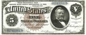
Strict mathematical averaging would be misleading. A note with an EF-40 face and a VF-20 back is not an XF-30 note in any meaningful collecting sense. The heavy wear on the back tells a story of hard circulation that the face corroborates only partially. In practice, the major grading services weight the face more heavily, with the face receiving approximately 55 to 65 percent of the grade weight depending on the note type. For portrait-heavy large-size notes such as the Series 1880 $100 Legal Tender (Fr. 168-171), where the Webster portrait on the face is the entire visual center of the note, the face carries closer to 65 percent weight. For notes where the back design is considered equally iconic, such as the 1896 Educational Series $1 Silver Certificate (Fr. 224-225) whose back carries the portraits of Martha and George Washington in an elaborate frame, graders treat both sides with closer to equal weight.
The 1896 Educational Series notes (Fr. 224-226) are among the few U.S. issues where back condition genuinely drives value almost as much as the face. A Fr. 224 $1 Educational in PMG Very Fine-30 with exceptional back color can command a premium of 20 to 30 percent over a technically equivalent example with a washed or dull back. Always request high-resolution back scans before bidding on these notes.
The “Net Grade” Concept and Asymmetric Defects
When a defect appears exclusively on one side, graders apply what is informally called a net grade adjustment. PMG’s published grading standards, for instance, distinguish between defects that affect a note’s “technical grade” and those that result in a net grade with a notation. A tear confined entirely to the back margin might reduce an otherwise VF-30 face to a net VF-25, noted as “VF-25 Net, Back Tear.” Collectors should understand that net grades with back-specific notations can represent strong value opportunities, because the face, which most people display, may genuinely appear VF-30 or better.
The reverse is also true and less commonly discussed. A note with a back that grades near Gem and a face that shows a single counting fold through the portrait will receive a grade reflecting that fold. No amount of pristine lathework on the reverse rescues a face with a hard crease through Lincoln’s ear on a Series 1923 $1 Silver Certificate (Fr. 237). Graders are unanimous that a single sharp vertical fold through the central portrait of any note constitutes the most damaging single-event defect possible, because it breaks fibers precisely where visual attention is highest.
Large-Size Notes: Where Asymmetry Matters Most
Large-size notes issued before 1929 show the most dramatic face-to-back asymmetry in the hobby. The format itself encourages it. At 7.42 inches by 3.13 inches, a large-size note folded in half for wallet storage creates a hard crease directly through the central vignette on the face, while the back fold lands in a relatively open field. Experienced dealers handling Series 1902 National Bank Notes (Fr. 616-663) and Series 1882 Brown Back Nationals (Fr. 487-518) know immediately that a note described as Fine overall will typically show a back closer to Very Fine-20 and a face worn to Fine-12 or below.
This asymmetry is so predictable that Heritage Auctions, Stack’s Bowers, and other major houses now routinely include separate back and face photographs in auction lot descriptions for large-size material above $500 in estimated value, a practice that became standard around 2010 and has meaningfully improved collector confidence in online bidding.
Small-Size Notes and the Problem of Counting Wear
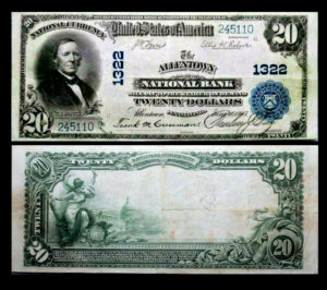
Small-size Federal Reserve Notes issued from 1928 onward show a different and subtler form of asymmetry. These notes were subject to mechanical counting by Federal Reserve Banks using rubber-roller counting machines, a process that leaves distinctive parallel striations running perpendicular to the long axis of the note. Crucially, notes were almost always fed face-down through these machines, so the striations appear on the back. A Series 1950-B $20 Federal Reserve Note (Fr. 2075) that was counted thousands of times at the Federal Reserve Bank of Chicago might show a near-Gem face and a back cross-hatched with faint roller marks, resulting in a final grade of Choice Very Fine-35 rather than the Extremely Fine-40 the face would suggest in isolation.
Graders at both PMG and PCGS Currency are trained to specifically examine the backs of small-size notes under magnification for these counting marks, especially on notes from the 1950s through 1970s when mechanical counting was at its peak before optical scanning replaced it. Star notes from this era, being replacements rather than counted originals, sometimes escaped the counting machines entirely and can show dramatically better back condition than regular-issue notes from the same series.
Star note replacements from the Federal Reserve Bank of New York for Series 1963A $1 FRNs (the B* district) sometimes bypassed the high-volume counting process and were shipped directly to fill small orders. These survivors occasionally surface with backs in Gem condition despite being removed from circulation decades ago. Always inspect the back of any star note under 5x magnification before concluding it is merely a common circulated example.
How Asymmetry Affects Gradeflation and Market Perception
The popular complaint about “gradeflation,” the perception that today’s graded notes receive higher grades than equivalent notes graded fifteen years ago, is partly an artifact of how back condition is being reconciled differently over time. Collectors who submitted notes in the early 2000s, when PCGS Currency launched in 2005 and PMG launched in 2005 as well, report that notes with marginally better backs than faces tended to receive the lower grade as the anchor. By the mid-2010s, collector and dealer feedback indicated that excellent back condition was being weighted more positively, particularly in the MS-63 to MS-65 range for star notes and low-print-run Federal Reserve Notes.
This shift matters enormously for registry set collectors. A note that would have graded PMG 64 EPQ in 2008 might well receive a PMG 65 EPQ today if its back is truly exceptional and its face shows only the most minimal handling. Buyers of high-grade slabbed currency should be aware that population data on older holders does not perfectly compare with population data on recent submissions.
| Series / Friedberg No. | Denomination / Type | Typical Face-Back Spread | Rarity |
|---|---|---|---|
| Fr. 224 (1896) | $1 Educational Silver Certificate | Up to 3 points, back-driven premium | Key Date |
| Fr. 379 (1890) | $1 Treasury / Coin Note | 1-2 points, face typically lower | Rare |
| Fr. 487-518 (1882) | Brown Back Nationals, large-size | 2-3 points, strong wallet fold pattern | Scarce |
| Fr. 237 (1923) | $1 Silver Certificate, large-size | 1-2 points, fold crease through portrait common | Scarce |
| Fr. 1963 (1963) | $5 FRN, small-size | 0-1 points, counting marks on back frequent | Common |
| Fr. 2075 (1950-B) | $20 FRN, small-size | 1-2 points, roller striations on back | Common |
| Fr. 168-171 (1880) | $100 Legal Tender, large-size | 2-4 points, Webster portrait absorbs wear | Rare |
| Fr. 616-663 (1902) | Date Back Nationals, large-size | 2-3 points, charter and geographic premiums | Scarce |
Practical Implications: Buying Raw vs. Slabbed
For collectors who buy raw notes at shows or through dealers, understanding asymmetric grading lets you self-assess more accurately before paying for third-party grading. The working rule is: grade the face conservatively, grade the back generously, then ask whether the gap between the two is normal (one to two points) or unusual (three or more points). If the gap is three or more points, the final slab grade will almost certainly anchor closer to the face grade than the back, and the note will not come back at the grade you hoped. If the back is actually weaker than the face, which happens with washed notes and pressed notes, submit the note only after careful consultation, because a note that looks VF-30 on the face but carries a washed or chemically treated back will receive a “details” or “net” designation regardless of apparent face quality.
Star notes and low-print-run issues are always worth submitting even when grade asymmetry is pronounced, because population data matters for those notes in ways it simply does not for common series. A PMG VF-25 Net for a Series 1928-C $5 Silver Certificate (Fr. 1653), with a known print run of roughly 588,000 notes and extremely few high-grade survivors, is still a meaningful and collectible slab even with a back notation.
Conclusion: Both Sides Tell the Story
A banknote is a physical artifact of commerce, and every fold, every counting mark, and every wallet rub on its back is as much a part of its biography as the portrait on its face. Professional graders understand that reconciling two sides into one number is not an act of compromise but an act of interpretation, one that requires knowing which side bore the burden of circulation and why. For collectors, internalizing this knowledge transforms the back of every note from an afterthought into evidence. Train your eye to read both sides with equal care, and you will find better notes, avoid over-graded slabs, and spot the occasional undervalued gem that everyone else flipped past too quickly.