Pick up a genuine Series 1934 $500 Federal Reserve Note and turn it over. What greets you is not the architectural grandeur of the $100’s Independence Hall, nor the monumental sweep of the $1,000’s ornate lettering field. Instead, you encounter something rarer in currency design: deliberate restraint. The reverse of this note is a study in proportion, negative space, and the quiet authority of fine intaglio engraving, executed at a moment when the Bureau of Engraving and Printing had refined its craft to something approaching perfection.
Context: The 1934 Series and Its Place in Currency History
The Series 1934 large-denomination Federal Reserve Notes were authorized under the provisions that had been reshaping American monetary policy since the Federal Reserve Act of 1913, but it was the economic pressures of the Great Depression and the regulatory environment of the early Roosevelt administration that gave this particular series its character. The $500 note served primarily interbank and large commercial transaction purposes. Ordinary Americans rarely encountered one in daily life, and that reality influenced the design philosophy: these notes needed to communicate institutional seriousness rather than popular accessibility.
The series ran through four suffix variants: the base 1934, then 1934A, 1934B, and 1934C, each reflecting a new Secretary of the Treasury and Federal Reserve Governor signature pairing. The 1934 base series carries the signatures of Henry Morgenthau Jr. as Secretary of the Treasury and Marriner Eccles as Federal Reserve Governor, a pairing that numismatists immediately associate with the green Treasury seal of the standard Federal Reserve era.
When examining a Series 1934 $500 note, always confirm the Federal Reserve district letter and number in the black seal on the obverse before assessing value. Notes from the Federal Reserve Bank of New York (District 2, letter B) were issued in the largest quantities, while districts like Minneapolis (District 9, letter I) and Dallas (District 11, letter K) produced far fewer notes, making those district examples considerably more desirable to advanced collectors.
Anatomy of the Reverse: What You Are Actually Looking At
The reverse of the Series 1934 $500 note measures the standard Federal Reserve note dimensions of 6.14 by 2.61 inches, and every square millimeter of that field is a considered design decision. The dominant visual element is the large, bold numeral “500” rendered in the center of the note in a style that owes a clear debt to the classical engraving traditions of the nineteenth century. This central denomination numeral is flanked by ornate lathe-work patterns, those intricate machine-ruled geometric designs that served both an aesthetic function and a crucial anti-counterfeiting purpose.
The words “THE UNITED STATES OF AMERICA” arc across the upper portion of the reverse in a clean, authoritative serif typeface, while “FIVE HUNDRED DOLLARS” is set in a somewhat smaller but equally commanding line near the lower register. What strikes most collectors who study the note closely is the sheer amount of open green field surrounding these elements. Where a lesser design might crowd in additional vignettes or decorative borders to fill the space, the BEP’s engravers allowed generous margins to breathe around each compositional element. The result is a design that feels confident rather than sparse.
The Lathe-Work and Guilloche Patterns: Security Through Beauty
The geometric engine-turned patterns on the reverse of the 1934 $500 note deserve particular attention from collectors who have not yet studied them with a loupe. The guilloche work, produced on specialized geometric lathes that the BEP had operated since the nineteenth century, creates repeating spiral and rosette patterns of extraordinary intricacy. These patterns were essentially impossible to replicate by hand engraving and extremely difficult to reproduce photographically with the technology available in the 1930s and 1940s.
On the $500 reverse, the lathe-work concentrates in panels to either side of the central “500” numeral and in border elements that frame the entire composition. Under magnification, the lines within these panels reveal a precision that remains impressive even by modern standards. The ink, applied through the intaglio process, stands slightly in relief from the paper surface, and running a fingernail across the reverse of a well-preserved example produces the characteristic slight drag that authentication experts use as a first-pass indicator of genuine period production.
Authentication is the first concern with any high-denomination 1934 Federal Reserve Note. The intaglio printing on genuine examples creates a tactile relief that no offset or inkjet reproduction can convincingly replicate. Pair a tactile check with ultraviolet examination: genuine notes from this era will not fluoresce brightly under UV light, while most modern reproductions on brightened paper will glow distinctly. If a note passes both tests, proceed to professional third-party grading through PCGS Currency or PMG before any significant transaction.
Color and Ink: The Green That Defined an Era
The reverse printing ink on Series 1934 Federal Reserve Notes is that distinctive deep green that became synonymous with American paper money throughout the twentieth century. The specific hue used in the 1934 series is slightly richer and less yellow-shifted than the green used in some post-war series, a subtle distinction that experienced collectors learn to recognize. Notes that have been stored in acidic environments or exposed to prolonged light may show fading toward olive or khaki tones, which can affect both aesthetic appeal and technical grade.
Original paper, produced from a rag stock with embedded red and blue security fibers, carries the reverse printing with exceptional fidelity when the note is in fine condition or better. Circulated examples often show a pleasing warm tone to the paper itself, the result of natural aging and handling oils, which creates an interesting counterpoint to the formal green of the printing. Many collectors actually prize lightly circulated examples of this note for exactly this reason: the note has a history written into its surface while still displaying the reverse design in readable detail.
Comparison with Contemporary High-Denomination Reverses
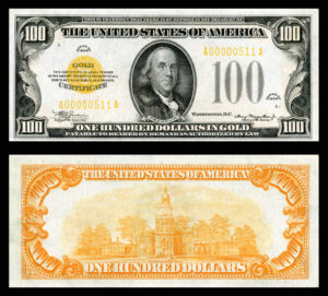
Placing the 1934 $500 reverse alongside its immediate denomination neighbors reveals the design hierarchy that the BEP clearly followed. The $1,000 Federal Reserve Note of the same series, featuring Grover Cleveland on the obverse, carries a similarly austere reverse built around a massive “1000” numeral, but the greater denomination seems to command slightly heavier ornamental framing. The $100 note, meanwhile, positions Independence Hall in a prominent engraved vignette that dominates its reverse composition, creating a far more pictorially active design.
The $500 sits in an interesting middle position: more decorative than the functional plainness of certain pre-Federal Reserve era designs, but more restrained than the vignette-heavy approach used on lower denominations where public familiarity was a design priority. This positioning reflects a clear institutional logic. The $500 was a denomination for serious financial transactions, and its reverse communicates that seriousness through a design language of dignified simplicity.
Grading the reverse condition of a Series 1934 $500 note independently from the obverse is good practice before submission to a grading service. The reverse is frequently in better condition than the obverse on circulated examples, since the note’s face, carrying the portrait and serial numbers, tends to receive more visual and physical contact. A note with a Choice Fine (CF 35) obverse and an Extremely Fine reverse can still achieve an overall grade of VF 30 or better, which meaningfully affects realized prices at auction.
Paper and Printing Plate Varieties: A Deeper Layer for Specialists
Advanced collectors pursuing the Series 1934 $500 note at a specialist level will find additional interest in the printing plate varieties that produced subtle but documentable differences in the reverse design across the series run. Plate numbers are printed in small numerals in the corners of both sides of the note, and tracking these numbers against known production records can help establish whether a given note came from an early, mid, or late production run within a given series suffix.
Early production runs occasionally show slightly heavier ink deposit in the guilloche areas, a characteristic of freshly machined plates before they develop the minute wear that distributes ink more evenly across the field. Late-run plates can sometimes show very slight weakness in the finest lines of the lathe-work. Neither condition is necessarily a defect in the strict grading sense, but both can be points of discussion in specialist-level acquisitions. The Paper Money Guaranty (PMG) population reports are invaluable for understanding how many examples at each grade level have been certified across the different district and series combinations.
| Series | Federal Reserve District | Est. Known / Print Run | Rarity |
|---|---|---|---|
| 1934 | New York (B) | Largest issue; hundreds known | Common |
| 1934 | Chicago (G) | Moderate issue; many known | Common |
| 1934 | San Francisco (L) | Moderate issue; several dozen known | Scarce |
| 1934 | Minneapolis (I) | Very small issue; fewer than 20 known | Rare |
| 1934 | Dallas (K) | Very small issue; fewer than 15 known | Rare |
| 1934A | New York (B) | Large issue; many known | Common |
| 1934A | Boston (A) | Small issue; scarce in any grade | Scarce |
| 1934B | Any district | Very limited across all districts | Rare |
| 1934C | Any district | Extremely limited; final series run | Key Date |
| 1934 (any) | Atlanta (F) or Richmond (E) | Fewer than 10 examples known each | Key Date |
What “Elegant Restraint” Means for Collector Value
There is a recurring tension in currency collecting between notes prized for ornate pictorial complexity and those valued for the dignity of simpler, well-executed design. The Series 1934 $500 note falls firmly in the second category, and it attracts a specific type of collector: one who has moved past the initial excitement of portraits and vignettes and learned to read the grammar of engraving itself. These collectors understand that the difficulty of executing clean, mathematically precise lathe-work across a large field is arguably greater than the challenge of engraving a recognizable portrait, because the lathe-work permits no impressionistic shortcuts.
From a pure market standpoint, the 1934 $500 note occupies a fascinating position. It is accessible enough that determined collectors can acquire a circulated example from a major auction house or established currency dealer without spending six figures, yet rare enough in higher grades that a PMG-graded Very Fine 30 or better example commands serious attention and serious money. The high-denomination recall of July 1969, when the Federal Reserve Board officially removed $500, $1,000, $5,000, and $10,000 notes from circulation, ensured that surviving examples reflect only what escaped destruction through collector acquisition or banking oversight.
Conclusion: Looking Again, Looking Closer
The reverse design of the Series 1934 $500 Federal Reserve Note rewards the collector who is willing to slow down. In an era when numismatic interest is sometimes driven by surface drama, the quiet sophistication of this note’s layout represents a different kind of appeal: the appeal of mastery expressed through discipline. The geometric precision of the guilloche work, the confident placement of denomination text in generous open space, and the depth of color achievable only through intaglio printing combine to create a composition that holds up to repeated study in a way that few currency reverses can match. Whether you are adding your first high-denomination note to a type set or pursuing a district-by-district collection of 1934 series issues, understanding and appreciating this reverse design is not just an aesthetic exercise. It is the foundation of informed, serious collecting.