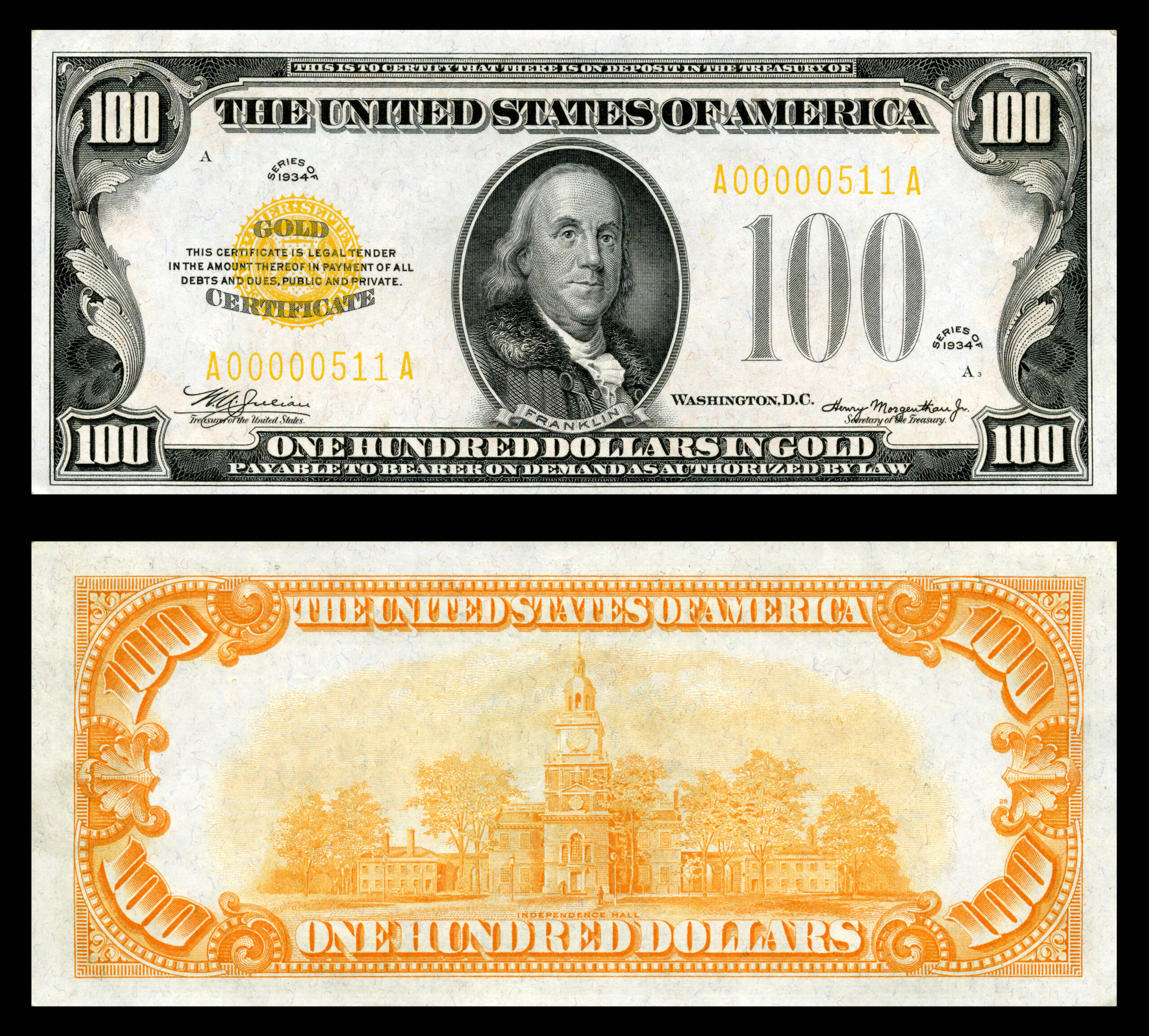
📷 Image source: Wikimedia Commons. Images are selected by AI to represent the article topic and may not depict the exact note(s) described.
A Currency Under Siege: Why the 1990s Demanded a New Approach
Walk into any coin show today and pick up a Federal Reserve Note from 1985. Then pick up one from 1996. The difference in feel, visual complexity, and outright sophistication is staggering. Between those two dates, the Bureau of Engraving and Printing (BEP) launched the most aggressive redesign campaign in modern American currency history, driven by a simple and alarming problem: counterfeiting had become dangerously easy.
The introduction of high-resolution color photocopiers in the late 1980s, followed quickly by desktop publishing software and inkjet printers capable of reproducing fine-line engraving with unsettling accuracy, forced the Treasury Department’s hand. What followed was a rolling series of security feature upgrades introduced in 1990, 1996, 2004, and 2006 through 2013 that fundamentally changed what a US banknote looks and feels like. For collectors, each of these phases produced distinct varieties, transitional series, and even some genuine rarities worth tracking down.
Phase One: The 1990 Additions — Subtle but Significant
The first meaningful post-1960s security upgrade arrived quietly with the Series 1990 notes. The BEP introduced two features simultaneously: an embedded polyester security thread running vertically through the paper, and microprinting along the portrait’s rim. On the $100 note, the thread was inscribed with “USA 100” and positioned to the left of the portrait, while the microprinting read “THE UNITED STATES OF AMERICA” repeated in letters so small they required magnification to read clearly.
For collectors, this creates an immediate and useful variety distinction. Series 1988A notes, signed by Treasurer Catalina Vasquez Villalpando and Secretary Nicholas Brady, lack both features entirely. Series 1990 notes with the same signature combination, or the later Withrow/Brady pairing, carry the new thread and microprinting. Circulated examples of pre-1990 high-denomination notes are increasingly hard to find in Fine or better grades, making the 1988A $100 a note worth setting aside.
The security thread’s position was denomination-specific by design: it appeared at a different horizontal location on each value so that a bleached $5 note reprinted as a $100 could be detected by thread placement alone. This was a deliberate, elegant solution to a very specific counterfeiting method that had already been exploited.
When examining Series 1990 through 1995 notes under UV light, the security thread glows pink on $100 notes and green on $50 notes. Thread fluorescence color is denomination-specific and was standardized as an additional verification layer. A note that glows the wrong color under UV is worth a very close second look.
Phase Two: The 1996 Redesigns — A Watershed Moment
The Series 1996 $100 Federal Reserve Note, bearing the signatures of Treasurer Mary Ellen Withrow and Secretary Robert Rubin, represented the single largest visual departure from traditional US currency design since the 1920s. Collectors who pulled one from circulation in 1996 were genuinely startled: the portrait of Benjamin Franklin was larger and off-center, the note carried a watermark portrait visible from both sides, the security thread now glowed pink under UV and was printed with “USA 100” in alternating orientations, and most dramatically, the numeral “100” in the lower right corner was printed in color-shifting ink (CSI).
Color-shifting ink, developed by SICPA of Switzerland under contract with the BEP, appears gold when viewed straight-on and shifts to green at an angle. This optically variable ink (OVI) relies on metallic flake particles suspended in the ink medium, oriented during application so that light reflects differently depending on viewing angle. It cannot be reproduced by photocopier or standard inkjet printer, making it one of the most effective anti-counterfeiting tools ever deployed on US currency.
The 1996 redesign was rolled out denomination by denomination over the following years: the $50 followed in Series 1996 as well, the $20 in Series 1998, the $10 in Series 1999, and the $5 in Series 1999 as well (though the $5 received fewer changes than higher denominations). Each denomination’s CSI numeral shifted from copper-gold to green. The $1 and $2 notes were deliberately excluded, as their low face value made them poor counterfeiting targets relative to the cost of redesign.
The Series 1996 $20 note signed by Withrow and Rubin is often overlooked by collectors focused on the more dramatic 2004 colorized issues. However, the 1998-dated $20 in crisp uncirculated grades represents good value, as it is the first $20 to carry the enlarged off-center portrait and CSI numeral. Look for examples graded PMG 66 or 67 EPQ, where the color-shift ink still displays vivid contrast.
Reading the Fine Print: Microprinting Varieties Across Series
Microprinting placement and text changed across series in ways that create genuine collectible varieties. On the Series 1990 through 1995 $100 notes, the microprinting read “THE UNITED STATES OF AMERICA” around the portrait. On the Series 1996 $100, the microprinting moved to two locations: “USA 100” on the security thread, and “THE UNITED STATES OF AMERICA” on the left lapel of Franklin’s coat. The $20 Series 1998 added “USA20” on the security thread and “THE UNITED STATES OF AMERICA” above the portrait’s left shoulder.
Collectors building denomination sets should document these microprinting differences as part of their variety attributions. Grading services such as PMG and PCGS Currency will occasionally note these in population report data, and some specialized collectors build sets specifically around tracking microprinting evolution across all denominations and series from 1990 through 2013.
Phase Three: The 2004 Colorization and the New Face of US Currency
When the Series 2004 $20 Federal Reserve Note entered circulation on October 9, 2003, public reaction ranged from delight to outrage. The note introduced background colors for the first time on US currency since the Gold Certificates of the early twentieth century: subtle peach and blue tones washed across the face and back of the note. The eagle on the reverse appeared against a blue field, and a green “20” was printed in the lower right of the face. The security thread, still glowing green under UV, was now accompanied by a redesigned Statue of Liberty watermark and shifted numeral in CSI.
The $50 Series 2004 followed, issued September 28, 2004, with red and blue background colors and a prominent American flag imagery. The $10 Series 2006 added orange, yellow, and red tones. Each redesign was deliberately staggered to manage public familiarity and distribution logistics. The $5 Series 2008 introduced pale blue and purple background hues and added two small “05” watermarks flanking the Lincoln portrait.
From a collecting standpoint, the 2004 through 2009 period is rich with signature variety combinations worth cataloging. The $20 Series 2004A, signed by Treasurer Anna Escobedo Cabral and Secretary Henry Paulson, differs from the 2004 Marin/Snow combination and is the type most commonly encountered in higher grades because many collectors pulled them from circulation immediately upon issue.
Phase Four: The 2009 and 2009A $100 Note and the 3-D Ribbon
The final major redesign within this era targeted the $100, always the highest-priority denomination for the BEP’s security engineers. The Series 2009A $100 note, issued on October 8, 2013 after years of production delays caused by a web-fed printing problem that generated unacceptable creasing, introduced two features that had never appeared on any circulating banknote from any nation: the 3-D Security Ribbon and the Bell in the Inkwell.
The 3-D Security Ribbon is not printed but woven into the paper itself, a blue ribbon embedded with images of bells and “100” numerals that shift position as the note is tilted. Unlike a standard security thread, the ribbon produces a genuine three-dimensional optical effect visible to the naked eye. The Bell in the Inkwell, printed in CSI on the reverse, shows a Liberty Bell that appears to emerge from and recede into a copper inkwell as the note is tilted, shifting between copper and green. The numeral “100” in the lower right corner retained CSI but shifted from gold-green to a deeper, more saturated copper-green transition.
The production delays meant that Series 2009 $100 notes (signed by Treasurer Rosie Rios and Secretary Timothy Geithner) saw extremely limited distribution before the 2009A superseded them. Series 2009 $100 notes are genuinely scarce in high grades and represent one of the more interesting modern rarities for collectors of Federal Reserve Notes.
If you encounter a Series 2009 $100 note, examine the serial number prefix. Notes with the prefix KB through KF were among the first produced and distributed in limited quantities before the printing problems were fully resolved. Uncirculated examples graded PMG 65 EPQ or better represent genuine scarcity and are worth submitting for certification rather than holding raw.
The $1 and $2 Exception: Why Some Notes Stayed the Same
Throughout this entire period of dramatic transformation, the $1 Federal Reserve Note and $2 Federal Reserve Note remained essentially unchanged in design, carrying the same portrait, reverse imagery, and lack of security features that they have exhibited since the Series 1963 redesigns. The Treasury’s official position is that the low face value of these denominations makes counterfeiting economically impractical. A counterfeiter spending materials and effort to produce a convincing $1 note earns $1. The calculus simply does not support the investment.
For collectors, this creates an interesting contrast set opportunity. A complete face set of current-design Federal Reserve Notes from $1 through $100 spans nearly five decades of design philosophy, from the pure engraving tradition of the $1 to the multilayered optical security theater of the 2009A $100. Building such a set in consecutive serial number pairs or district-matched sets is a popular modern collecting specialty.
| Series / Date | Denomination / Variety | Estimated Print Run / Notes | Rarity |
|---|---|---|---|
| Series 1988A | $100, no security thread (last pre-1990 type) | Final pre-thread run; widely circulated | Scarce in UNC |
| Series 1990 | $100, first thread and microprinting | Large run; transitional type | Common |
| Series 1996 | $100, first CSI numeral, Withrow/Rubin | Very large; widely saved by public | Common |
| Series 1996 | $100 star notes, Atlanta (F*) | Approx. 640,000 | Scarce |
| Series 2004 | $20, first colorized $20, Marin/Snow | Large initial run; many saved | Common |
| Series 2004 | $50 star notes, Minneapolis (I*) | Approx. 320,000 | Rare |
| Series 2006 | $10, colorized, Cabral/Paulson | Large run; relatively few saved by collectors | Common |
| Series 2009 | $100, pre-delay issue, Rios/Geithner | Very limited early distribution | Key Date |
| Series 2009A | $100, 3-D ribbon, first full release Oct. 2013 | Large ongoing run | Common |
| Series 2009A | $100 star notes, San Francisco (L*) | Approx. 640,000 | Scarce |
Grading Considerations for Security-Era Notes
Security features introduce unique grading challenges. The color-shifting ink on CSI numerals is prone to wear on circulated examples, and even light handling can diminish the shift effect on lower-grade notes. PMG and PCGS Currency graders look for full, vivid CSI response when assigning the EPQ (Exceptional Paper Quality) designation. A Series 1996 $100 graded 65 EPQ will show a sharp, high-contrast gold-to-green shift; a problem-free 63 might show slightly muted shift due to even minimal handling.
Security threads can also cause grading issues. A thread that has partially delaminated from the paper substrate, even without other visible damage, will typically result in a “net” grade or a details designation. Collectors building high-grade registry sets of modern Federal Reserve Notes should handle their notes exclusively by the edges and store them in archival Mylar sleeves before submission.
For collectors assembling sets of colorized Federal Reserve Notes from the 2004 through 2013 period, consider focusing on Federal Reserve Bank district varieties in star note form. Districts with smaller populations and regional banking networks, particularly Minneapolis (I), Kansas City (J), and Dallas (K), consistently produced lower star note print runs than New York (B) or Atlanta (F), making district-specific star sets both challenging and rewarding to complete.
Conclusion: A Living Document of Anti-Counterfeiting History
The Federal Reserve Notes produced between 1990 and 2013 are not merely currency. They are sequential chapters in a technical arms race between government security engineers and increasingly sophisticated counterfeiters. Each phase, from the quiet thread insertion of 1990 to the optically astonishing 3-D ribbon of 2013, tells the story of a nation defending the integrity of its economic foundation one security feature at a time.
For collectors, this era offers a uniquely accessible and historically rich specialty. Unlike the rarefied world of large-size nationals or colonial era paper money, security-era Federal Reserve Notes can still be found in circulation, pulled from change, or acquired at face value. Building a complete type set spanning 1990 to 2013, documenting every major security feature introduction across all redesigned denominations, is an achievable and genuinely instructive collecting goal. And it all starts with knowing exactly what to look for, in exactly the right light, at exactly the right angle.