📷 Image source: Wikimedia Commons. Images are selected by AI to represent the article topic and may not depict the exact note(s) described.
Pull any raw $1 Silver Certificate from a dealer’s box, hold it up to the light, and you will notice something almost immediately: the printed design rarely sits perfectly centered within the paper. Sometimes the shift is subtle, a millimeter or two toward the left border. Other times it is dramatic enough that the Federal Reserve District letter nearly kisses the edge. That physical relationship between the inked design and the surrounding white paper, what numismatists call centering or margins, is one of the most consequential and most underappreciated factors in currency grading. A note that looks crisp, bright, and fold-free can still land in a PMG 64 holder instead of a 66 purely because of how the Bureau of Engraving and Printing (BEP) fed the sheet through the press on the day it was printed.
Why Margins Matter: The Mechanical Reality of Currency Printing
To understand why centering is so variable, you have to understand how currency is actually printed. The BEP uses intaglio presses, the same basic technology employed since the nineteenth century, in which engraved steel plates transfer ink under enormous pressure onto dampened paper. A single sheet of currency paper carries multiple notes arranged in rows and columns. After printing, the sheets are dried, checked, overprinted with serial numbers and Treasury seals, and then cut down to individual notes.
That final guillotine cut is where centering is determined. If the sheet is fed slightly off-square, or if the cutting blade is even a fraction of a millimeter out of alignment, every note on that sheet will have unequal margins. On a standard modern Federal Reserve Note measuring approximately 6.14 by 2.61 inches, a shift of just 1.5 to 2 millimeters is enough to be noticeable to a trained grader. On the larger pre-1929 currency measuring roughly 7.42 by 3.18 inches, the tolerances were even less forgiving because the design elements extended closer to the sheet borders.
When examining a raw note at a show or auction, use a small plastic ruler to measure opposing margins before making an offer. A difference of more than 2 mm between the top and bottom borders, or left and right borders, will almost certainly draw a centering comment from PMG or PCGS and may push the note down one or two grade points from what its surface quality alone would suggest.
How PMG Evaluates Centering
Paper Money Guaranty grades notes on a scale from 1 to 70, mirroring the Sheldon scale used in coin grading. Within that framework, centering is assessed as part of the overall “eye appeal” evaluation, but it carries specific consequences that are spelled out in PMG’s grading standards. For notes grading PMG 65 Gem Uncirculated and above, PMG expects margins to be well-centered with only minor deviation allowed. A note with a noticeably shifted design, even if it exhibits no folds, no tears, and bright original paper, will be capped at PMG 64 Choice Uncirculated or lower depending on severity.
PMG uses a series of adjectival qualifiers alongside the numeric grade. A note assigned PMG 65 EPQ (Exceptional Paper Quality) must satisfy centering requirements in addition to being free of unnatural alterations. If the margins are off but everything else is perfect, PMG may award the number 65 yet withhold the EPQ designation, signaling to the marketplace that the note has a specific visual issue. Collectors chasing registry sets or condition censes need to understand this distinction acutely, because an EPQ-qualified note typically commands a substantial premium over a non-EPQ example at the same numeric grade.
How PCGS Currency Handles the Same Problem
PCGS Currency, operated under Collectors Universe, approaches centering in a structurally similar way but with some differences in terminology and thresholds. PCGS uses the PPQ (Premium Paper Quality) designation as its equivalent to PMG’s EPQ. Like PMG, PCGS will assign a numeric grade that reflects overall condition but will note centering issues through the qualifier system. In the PCGS grading standards, a note grading 66 PPQ is expected to have margins that are at minimum “above average” on all sides, with the design not touching or cutting into any border.
One practical difference collectors notice is that PCGS graders sometimes appear slightly more lenient on minor centering shifts at the 63 and 64 grade levels for certain series where well-centered examples are genuinely rare. This reflects a population-adjusted approach: if 90 percent of known examples of a particular series show some degree of shift, grading those notes harshly for an inherent production characteristic would make the registry unrepresentative of the actual surviving population.
When comparing PMG and PCGS-graded notes of the same series, always check whether the PPQ or EPQ qualifier is present before drawing grade-to-grade price comparisons. A PCGS 65 PPQ and a PMG 65 EPQ are broadly equivalent signals of quality, but a non-qualified 65 from either service may represent a note with centering or paper issues that the numeric grade alone does not fully communicate.
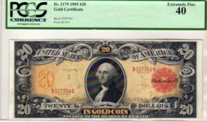
Large Size Notes: Where Centering Becomes Especially Critical
The centering issue is most dramatic, and most consequential for valuations, in Large Size currency issued before 1929. Notes such as the 1899 $5 “Indian Chief” Silver Certificate, the 1901 $10 “Bison” Legal Tender Note, or the spectacular 1896 Educational Series are works of engraved art where the design fills nearly the entire face of the note. On these issues, even a 2 mm shift toward one border can make the ornate lathe-work borders appear cramped or clipped on one side while leaving an awkward gap on the other.
A well-centered 1901 $10 Legal Tender in PMG 64 EPQ can bring $8,000 or more at major auction. An identically graded example without the EPQ qualifier, or one downgraded to 63 due to poor centering, might realize $3,000 to $4,500 for the same note with the same surface quality. That gap, measured in thousands of dollars, exists entirely because of where the guillotine fell on a sheet printed more than a century ago.
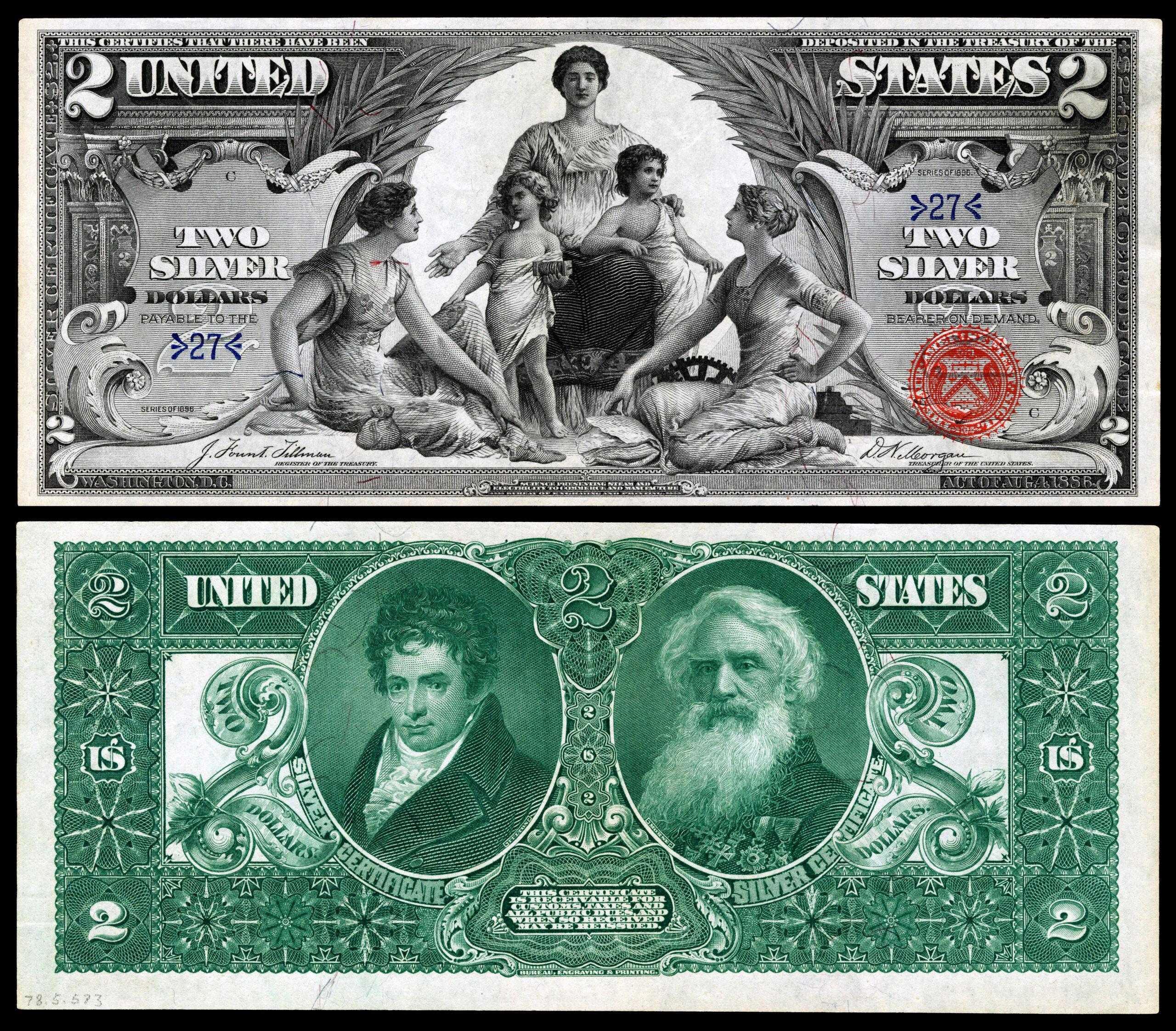
The 1896 Educational Series deserves special mention. These three denominations ($1, $2, and $5) feature allegorical designs by Will H. Low and Edwin H. Blashfield engraved by the BEP’s finest craftsmen. Because the designs extend so close to the sheet borders, finding examples with four full margins is legitimately challenging. PMG population reports consistently show that notes grading 65 EPQ or higher represent a small single-digit percentage of all graded examples for the $2 and $5 denominations.
Small Size Notes and the Post-1928 Era
When currency shrank to its current dimensions in 1928, the BEP adjusted its printing tolerances, but centering problems did not disappear. The Series 1928 through approximately Series 1950 Federal Reserve Notes are notorious among condition collectors for inconsistent margins. This is partly because the BEP was still calibrating its equipment for the new format and partly because wartime paper shortages in the early 1940s led to expedited production schedules that sacrificed quality control.
Star notes from this era present a particular challenge. Because star replacement notes were printed in smaller batches and sometimes on different press runs, their centering characteristics can differ from regular-issue notes of the same series and district. A 1934-A $100 Federal Reserve Note star note from the San Francisco district (L*) is already a scarce piece; finding one with four strong margins that qualifies for PMG 65 EPQ is a genuine achievement that collectors recognize with substantial premiums.
For Series 1928 through 1950 small size notes, always request population data from PMG or PCGS before bidding on a top-pop example at auction. In many districts and signature combinations, only one or two examples hold the highest EPQ or PPQ grade, which means you may be looking at a legitimately world-class note rather than simply a common issue that graded well.
Sheet Position and Its Relationship to Centering
Advanced collectors of modern Federal Reserve Notes have documented something fascinating: certain sheet positions consistently produce better-centered notes than others. On a 32-subject sheet, notes printed in the interior rows tend to show more balanced margins than notes cut from the extreme edges of the sheet, where blade alignment errors are most likely to accumulate. While the BEP does not release sheet position data to the public, numismatists have reverse-engineered positional tendencies by analyzing serial number blocks and comparing margin characteristics across large populations of the same series.
This phenomenon also explains why collector-favorite “lucky” serial numbers, solid numbers, radars, and low serials, do not automatically correspond to great centering. A $1 Federal Reserve Note with serial number 00000001 comes from a specific sheet position that may or may not have been well-centered; the desirability of the number is entirely independent of the printing quality surrounding it.
| Series / Issue | Denomination or Variety | Approx. EPQ/PPQ Pop. at 65+ | Rarity |
|---|---|---|---|
| 1896 Educational | $2 “Science” | Fewer than 10 at PMG 65 EPQ | Key Date |
| 1901 Legal Tender | $10 “Bison” | Approx. 15 to 25 at PMG 65 EPQ | Rare |
| 1899 Silver Certificate | $5 “Indian Chief” | Approx. 20 to 35 at PMG 65 EPQ | Rare |
| 1928 FRN (all districts) | $20 Small Size | Fewer than 40 total across districts at 65 EPQ | Rare |
| 1934-A FRN | $100 San Francisco (L*) | Fewer than 5 at PMG 65 EPQ | Key Date |
| 1950 FRN | $50 (all districts) | Moderate population, approx. 50 to 80 at 65 EPQ | Scarce |
| 1969-C FRN | $1 (most districts) | Large population; well-centered examples common | Common |
| 1995 FRN | $1 Atlanta (F*) Star | Small print run; gem-centered examples scarce | Scarce |
| 2003-A FRN | $2 (all districts) | Well-centered examples relatively available in gem | Common |
Practical Strategies for Submitters
If you are sitting on a collection of raw notes and preparing a submission to PMG or PCGS, centering assessment before you spend the submission fee can save real money. Under good direct lighting, hold each note so that you are looking squarely at its face. The left and right margins should appear equal. Then rotate the note 90 degrees and check the top and bottom. Any obvious asymmetry is a centering issue that will be noted by the grader.
For notes where you suspect borderline centering, consider whether the series is one where well-centered examples are known to be scarce. If you have a 1928 $5 Legal Tender Red Seal that appears slightly off-center but is otherwise choice uncirculated, submitting it may still be worthwhile because even a PMG 63 EPQ is a strong grade for that series. Conversely, if you have a 1977 $1 Federal Reserve Note that is slightly off-center, you are probably looking at a PMG 64 or 65 non-EPQ result on a note that has almost no collector premium in that grade range, making submission economically questionable.
The PMG and PCGS population reports are free to access online and are invaluable tools before any submission. Search for your specific series, denomination, and district to see what grades exist and how the EPQ or PPQ qualifier is distributed across the population. If you find that most graded examples of a given note top out at 64 non-EPQ, that is a strong signal that centering or paper issues are endemic to the series, and expectations for your own example should be calibrated accordingly.
Conclusion: Margins Are Not a Minor Detail
In currency collecting, centering is not a cosmetic footnote. It is a primary determinant of grade at the upper end of the scale, a key factor in whether a note receives the coveted EPQ or PPQ designation, and a direct driver of market value that can translate into thousands of dollars of difference on a single note. The Bureau of Engraving and Printing did not concern itself with the future collector market when it ran sheets through guillotine cutters decades ago, which means the distribution of well-centered survivors is essentially random and fixed. That scarcity of ideal margins on historically desirable notes is precisely what makes the pursuit of top-pop, fully-margined examples one of the most intellectually and financially rewarding challenges in the entire hobby. When you finally seal a beautifully centered gem in your collection, you are holding something that escaped more than a century of mishandling, environmental exposure, and mechanical imperfection. The white space around that design earned its grade.