📷 Image source: banknote.ws (World Banknote Gallery). Images are selected by AI to represent the article topic and may not depict the exact note(s) described.
A Banknote as a Work of Art
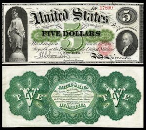
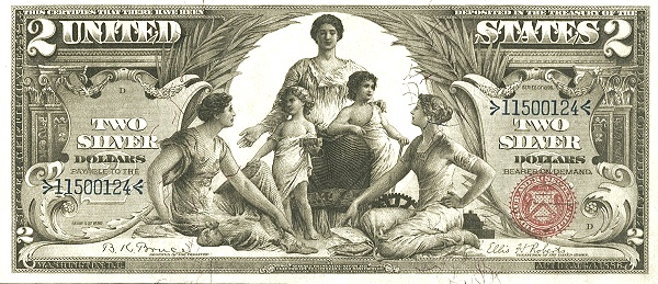
Walk into any advanced paper money auction and the lots that draw the longest pauses, the sharpest pencils, and the most heated bidding are almost inevitably the Educational Series Silver Certificates of 1896. The $1, $2, and $5 denominations of that series represent the high-water mark of American banknote engraving, a fleeting moment when the Bureau of Engraving and Printing operated more like a fine-arts institution than a government security printer. Of the three reverses in the series, the $2 is arguably the most intellectually layered. Its central allegorical figure, representing Mechanics, stands within a composition that weaves together themes of industrial labor, electrical power, and the neo-classical aesthetic that dominated American civic life in the Gilded Age. To collect this note without understanding that imagery is to own a painting without reading the title.
The Educational Series in Context
The Educational Series emerged from a broader cultural ambition in 1890s Washington to elevate the visual language of American money. Treasury officials and BEP leadership, influenced by the Beaux-Arts movement then reshaping public architecture across the country, commissioned a group of prominent illustrators and painters to provide original designs. The artist Edwin Blashfield, best known today for his monumental dome mural in the Library of Congress, contributed concept work for the series. The engravers who translated those concepts onto steel dies, men like Charles Schlecht and G.F.C. Smillie, were among the finest craftsmen the BEP ever employed.
The $1 obverse famously shows History instructing Youth in the use of the printing press. The $5 obverse presents Electricity as a dominant force, flanked by Commerce and Manufacture. The $2 obverse depicts Science presenting Steam and Electricity to Commerce and Manufacture. Each denomination tells a piece of an interconnected story about American industrial and intellectual progress. The reverses, often discussed less than the ornate obverses, complete that story with equal sophistication.
Reading the Reverse Composition
The reverse of the 1896 $2 is a horizontal composition dominated by two large portrait vignettes: Generals Ulysses S. Grant and Philip Sheridan. But the structural backbone of the design is not those portraits. It is the central allegorical grouping that ties the entire reverse together visually.
The central female figure representing Mechanics is rendered in the classical tradition, robed but with one arm raised and gesturing toward a large dynamo positioned at her side. The dynamo is not a vague industrial prop. It is a deliberately specific reference to the alternating-current generators that had only recently been commercialized by George Westinghouse and made famous at the 1893 World’s Columbian Exposition in Chicago, just three years before this note entered circulation. The choice to place a dynamo rather than a steam engine, a loom, or a gear train is a pointed editorial decision, signaling that electricity specifically represents the future of American industrial power.
The figure’s posture and drapery follow the conventions of Beaux-Arts allegory precisely. Her weight is shifted in a subtle contrapposto, a pose inherited directly from ancient Greek sculpture that connotes both stability and purposeful motion. Her gaze is directed outward, toward the viewer, giving her a civic authority rather than a contemplative introversion. She is not reflecting on industry. She is presenting it, advocating for it, in the manner of a civic personification rather than a mythological character.
When examining a 1896 $2 Educational note under magnification, pay close attention to the cross-hatching on the dynamo vignette at center reverse. On genuine, high-grade examples the lathe-turned geometric patterns surrounding the portrait ovals remain crisp and unbroken. Washed or improperly pressed notes often show flattening or merging of these fine engine-turned lines, which directly affects technical grade and eye appeal.
The Flanking Architectural Elements
Surrounding the central allegorical figure and the portrait vignettes is a framework of Roman architectural detail: pilasters, cornices, and decorative friezes rendered in extraordinary relief through the engraver’s tools. This was deliberate. The neo-classical architecture visible in the reverse border was a visual argument, common in Gilded Age civic design, that American industrial civilization was the legitimate heir to the rational order of ancient Rome and Greece.
The pairing of Grant and Sheridan within this architectural frame is also meaningful. Both men were Union generals whose victories had preserved the industrial North, the very economic system whose power the Mechanics allegory celebrates. Grant, who served as the 18th President, and Sheridan, the brilliant cavalry commander of the Shenandoah campaign, were among the most beloved military figures of the era. Their portraits lend the reverse an aura of historical authority and patriotic gravity that balances the idealism of the allegorical figure.
Engraving Technique and the Rendering of Mechanics
What separates the Educational Series reverses from virtually every other American banknote design is the quality of the siderographic engraving applied to the figurative work. The Mechanics allegory was engraved directly into steel, requiring the craftsman to work in mirror image and in intaglio, cutting away material to create raised printed lines. The gradations of tone in the figure’s drapery, the highlights on the dynamo casing, and the subtle shading of the architectural backgrounds were all achieved through controlled variation in the depth, spacing, and angle of hand-cut lines.
This is fundamentally different from photomechanical reproduction processes, and it explains why high-grade examples of the $2 Educational note retain an almost three-dimensional tactile quality when the ink relief is intact. On a Gem Uncirculated note graded PMG 65 EPQ or better, running a fingertip lightly across the central reverse vignette reveals the intaglio printing in a way that no reproduction, photograph, or digital image can replicate. That physical quality is part of the note’s value as a collectible object.
The 1896 $2 Educational note is found with two signature combinations: Tillman-Morgan (Register of the Treasury William S. Tillman and Treasurer Daniel N. Morgan, Fr. 247) and Bruce-Roberts (Register Roswell B. Bruce and Treasurer Ellis H. Roberts, Fr. 248). The Bruce-Roberts combination is considerably scarcer in high grades. When buying either variety above Fine condition, always request a full population report from PMG or PCGS Currency before negotiating price.
The Dynamo as Cultural Symbol
It is worth pausing on the dynamo imagery at some length, because it was not an obvious choice and its presence reflects a very specific cultural moment. Historian Henry Adams, in his famous meditation written around 1900 and later published in “The Education of Henry Adams,” described standing before a dynamo at the Paris Exposition of 1900 and feeling that the machine represented a new force in human civilization comparable to the medieval cult of the Virgin. Adams was writing retrospectively, but the dynamo’s symbolic power was already apparent in the mid-1890s to educated Americans.
The Westinghouse alternating-current system had won the “War of Currents” against Edison’s direct-current infrastructure by 1893, and the illumination of the Columbian Exposition’s White City with AC electricity had made that victory spectacular and very public. When BEP designers placed a dynamo beside the Mechanics allegory on currency issued in 1896, they were doing something culturally audacious: they were declaring that electrical power was now as legitimate a symbol of American civilization as the eagle, the Goddess of Liberty, or the portrait of a founding father.
Condition Considerations for Collectors
The 1896 $2 Educational note presents several specific condition challenges that collectors must understand. The large-format note (approximately 7.375 x 3.125 inches, the large-size standard that remained in use until 1929) means that corner folds are the most common grade-limiting flaw. Even notes that appear crisp from the face frequently reveal fold breaks at one or more corners under raking light.
Paper quality is another critical variable. Silver Certificates of this era were printed on a cotton-fiber stock that is generally more durable than the paper used for some National Bank Notes of the same period, but the $2 Educational is large enough that handling stress concentrates at the margins and along the vertical center fold that many examples carry from original bank storage. A note with a single light vertical fold but strong color and paper quality will often outperform a technically higher-graded example with edge nicks or staining in terms of collector desirability and realized price.
The blue Treasury seal on the obverse should be deep and saturated on high-grade examples. Fading of the seal color is a red flag that may indicate washing or chemical treatment. Similarly, the serial numbers on the $2 Educational appear in blue ink on the face, and any blurring or spreading of the serial digits warrants careful scrutiny.
Beware of pressed or “doctored” examples of the 1896 $2 Educational note. Because these notes command strong premiums even in middle grades, some have been pressed to hide folds. Place the note under a strong single-direction light source at a low angle and look for the slightly glazed, flattened surface texture that pressing produces. Genuine, untouched VF examples will show micro-surface texture consistent with aged cotton paper rather than the artificially smooth finish that pressing creates.
| Friedberg No. | Signatures | Est. Surviving Pop. | Rarity |
|---|---|---|---|
| Fr. 247 | Tillman-Morgan | ~1,200 known | Scarce |
| Fr. 247 (VF-EF) | Tillman-Morgan, circulated mid-grade | ~600 examples | Scarce |
| Fr. 247 (Gem CU, EPQ) | Tillman-Morgan, PMG 65+ | Fewer than 40 | Rare |
| Fr. 248 | Bruce-Roberts | ~400 known | Rare |
| Fr. 248 (Fine or better) | Bruce-Roberts, F-12 and above | ~180 examples | Rare |
| Fr. 248 (Choice CU, EPQ) | Bruce-Roberts, PMG 63+ | Fewer than 15 | Key Date |
| Fr. 247 (VG or below) | Tillman-Morgan, heavily circulated | ~500+ examples | Common |
| Fr. 248 (VG or below) | Bruce-Roberts, heavily circulated | ~150 examples | Scarce |
The $2 Educational in the Broader Educational Series
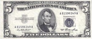
Collectors assembling a complete Educational Series type set face a hierarchy of difficulty. The $1 (Fr. 224-226) is the most available denomination and makes an excellent entry point. The $5 (Fr. 270-271) is dramatically scarce in high grade due to its heavier circulation as a higher-denomination working note. The $2 sits in an interesting middle position: more available than the $5 but carrying, in many collectors’ eyes, the most compositionally rich reverse of the three denominations.
Budget-conscious collectors should know that a presentable Very Fine example of Fr. 247 can still be acquired for well under $1,000 at major auction houses, making it one of the most accessible entry points into the Educational Series. A comparable grade $5 Educational would cost several times that amount. For the collector whose primary interest is the artistic and historical content rather than condition perfection, the $2 in VF to EF condition offers extraordinary visual reward per dollar spent.
Legacy of the Mechanics Allegory
The 1896 Educational Series was controversial almost from the moment it entered circulation. Critics in Congress and in the press objected to the semi-draped allegorical figures on the obverses, calling them inappropriate for everyday commerce. By 1899, the Treasury Department had replaced the Educational Series with a new design featuring portrait-centric layouts that would remain the dominant American currency aesthetic for the next century.
That short production window, roughly 1896 to 1899, combined with the notes’ heavy use in circulation, is precisely what makes survivors so prized today. The Mechanics allegory on the $2 reverse had only a few years to make its argument about electricity, industry, and American civilization before being retired to the archives. That it survived at all in collectible condition is partly luck, partly the care of early collectors who recognized the series’ exceptional quality even in its own time.
For the modern collector, the $2 Educational reverse is a compressed history lesson, a meditation on the Gilded Age, a technical masterpiece of the engraver’s craft, and a highly liquid collectible asset. Each of those qualities independently justifies its place in a serious collection. Together they make it one of the most compelling objects in all of American numismatics.