Pick up any pre-1990 Federal Reserve Note and hold it at an angle under a strong light. What you will find is not simply a printed image but a landscape of microscopic furrows, dots, and ruled lines pressed into the paper with extraordinary precision. The portraits of Lincoln, Hamilton, Jackson, and Franklin that Americans carry in their wallets every day are the product of a centuries-old printmaking tradition refined over more than 150 years by the skilled engravers of the Bureau of Engraving and Printing. Two techniques sit at the absolute heart of this artistry: crosshatching and stippling. Together, they allow a flat steel die to convey the roundness of a human cheek, the softness of an aging eye, and the texture of a wool coat collar. This guide takes collectors inside that process.
What Intaglio Printing Actually Does
Before examining individual techniques, it helps to understand the medium itself. Intaglio printing, used by the BEP for the face of virtually every US currency note from the 1860s through the present day, works by pressing dampened, high-cotton-fiber paper into recessed lines and dots cut into a hardened steel plate. The ink sits below the surface of the plate, and the printing press forces paper fibers down into those recesses under pressures exceeding 20 tons per square inch. The result is ink that stands slightly proud of the paper, creating the tactile ridge that currency collectors and the public alike can feel with a fingernail.
This raised-ink characteristic is not merely a security feature. It is the physical consequence of ink being pulled from recessed lines, and the depth of each line directly controls how much ink transfers to the paper. Deeper cuts yield more ink and therefore darker tones. Shallower, more delicate cuts deposit only a thin film. The engraver’s entire tonal vocabulary rests on manipulating this relationship across thousands of individual marks.
Crosshatching: Building Shadow with Geometry
Crosshatching is the practice of laying one set of parallel lines over another at an intersecting angle, typically between 30 and 90 degrees, to create areas of dense tonal value. In currency engraving the technique becomes extraordinarily sophisticated because the lines are not straight mechanical rules but gently curving contour lines that follow the three-dimensional form of the subject’s face.
Look closely at the portrait of Alexander Hamilton on a Series 1928 Federal Reserve Note, engraved primarily from the work of G.F.C. Smillie. The deep shadows beside Hamilton’s nose and beneath his chin are built from multiple overlapping layers of crosshatched lines. The first layer might run diagonally from lower-left to upper-right. A second layer crosses it at roughly 45 degrees. A third, even finer layer may reinforce the darkest passages. Where the intersections are densest, the eye reads near-black. Where lines thin and begin to separate, the tone lightens progressively toward the bright highlights of the forehead, which may carry only the finest single-direction lines or no engraving at all.
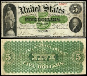
The spacing between lines is equally important. A trained engraver like Charles Burt, who created the Lincoln portrait used on early Legal Tender Notes beginning in the 1860s, understood that converging lines could suggest the curving recession of a surface while diverging lines implied a surface turning toward the viewer. This means the geometry of the crosshatching itself communicates form independent of tone alone.
To examine crosshatching properly, use a loupe of at least 10x magnification held at a low, raking angle under a single strong light source. Avoid diffuse overhead lighting, which flattens the relief and makes individual lines harder to differentiate. A fiber-optic or LED flashlight held nearly parallel to the note surface reveals the three-dimensional ink ridges dramatically.
Stippling: The Language of Dots
Where crosshatching builds tone through intersecting lines, stippling creates gradation through fields of individual dots varying in size, depth, and spacing. Engravers used burins of different profiles to punch or rock small indentations into the steel die. A fine, closely spaced stipple produces a smooth, almost continuous-tone effect well suited to rendering soft skin, muted backgrounds, and the transitional mid-tones of a face. A coarser, more openly spaced stipple reads as a lighter, airy tone.
Stippling is particularly prominent in the portrait work found on older National Bank Notes and United States Notes from the 1870s and 1880s. The portrait of Salmon P. Chase on early Legal Tender issues shows beautifully resolved stippled flesh tones in the forehead and cheek areas, transitioning into crosshatched shadows along the jawline and neck. This combination of stipple for gradual tonal shifts and crosshatch for structural dark passages became the standard compositional strategy for BEP portrait engravers through much of the late nineteenth and early twentieth centuries.
A subtler variant is the technique of combining stipple dots directly with hairline engraved lines within the same passage. This hybrid approach softens the mechanical regularity of pure crosshatching and was used extensively in the portraits engraved for the large-size Notes of the 1899 to 1923 period, widely regarded by collectors as the artistic high point of American currency design.
The quality of stippling deteriorates measurably on heavily circulated notes because the raised ink dots wear down first, losing their crisp edges and eventually merging into blurry gray masses. When grading a large-size note for eye appeal, compare the sharpness of stippled cheek areas to known high-grade examples. A note in apparent Fine condition but with well-preserved dot structure often has exceptional originality worth noting in a collection.
The BEP Engravers Who Defined American Currency Portraiture
Understanding the techniques becomes richer when tied to specific artists. George F.C. Smillie joined the BEP in 1894 and remained active until the 1920s. He is responsible for the Lincoln portrait used on the Series 1923 $5 Silver Certificate, one of the most technically accomplished pieces of currency engraving in American history. Smillie favored very fine crosshatch work laid over a stipple foundation, creating a luminous mid-tone register that gives his faces an almost photographic quality when viewed under magnification.
Marcus W. Baldwin engraved several portraits for early Federal Reserve Notes, including contributions to the $10 Jackson portrait seen on large-size Series 1914 notes. Baldwin’s style leaned more heavily on structured geometric crosshatching with sharper tonal contrasts than Smillie’s more atmospheric approach.
Joachim C. Benzing, active from the 1930s through the 1950s, worked during the transition to small-size notes and adapted earlier large-scale portrait conventions to the reduced real estate available on post-1928 currency. His skill at compressing complex tonal information into a portrait space barely one inch across is evident on the small-size Series 1934 and 1950 notes, where the Franklin and Lincoln portraits retain remarkable resolution when examined at high magnification.
How Reduction and Transfer Affected Engraving Quality
The original portrait dies were engraved at a scale larger than the final printed note, then reduced mechanically through a transfer press to create the working die used for printing. This reduction process compressed the line spacing and dot fields proportionally, which could either enhance apparent sharpness, because fine details became even finer, or degrade clarity if the reduction ratio was too aggressive. Collectors examining Series 1928 small-size notes immediately following the large-size era often notice a slight loss of open tonal range in the portraits: the shadows are adequately rendered but the luminous mid-tones of the best large-size work are harder to achieve at reduced scale.
Successive transfers from die to hub to new die also accumulated small distortions. Portrait engraving quality on later printings of a given series can subtly differ from early printings if intermediate transfer steps introduced shallow scratches or slight flattening of delicate stippled areas. This is one reason why collectors who focus on engraving quality pay close attention to early serial number ranges and, in some series, specific Federal Reserve Districts whose plates were struck from earlier transfer generations.
For small-size Federal Reserve Notes from the 1928 through 1950 series, the Boston (A) and New York (B) district notes were typically printed first from newly prepared plates. If you want to find the sharpest early impressions of any given series portrait, start with low-serial-number Boston and New York examples and compare the facial detail directly against later-district printings from the same series.
Identifying Engraving Degradation Versus Wear
Collectors sometimes confuse two distinct forms of portrait deterioration: mechanical wear from circulation and plate wear from extended use of a printing plate. Circulation wear removes ink from the raised surface, beginning with the finest lines and dot edges. Plate wear, by contrast, affects the die itself over millions of impressions: very fine crosshatch lines gradually fill with dried ink and debris, and the printing impression lightens or muddies without the note ever having circulated. Notes printed late in a plate’s production run can show this plate fatigue even in uncirculated condition, appearing slightly flat or gray in the facial shadow areas despite being technically new. Grading services evaluate printing quality as a separate consideration from preservation state, and a note with advanced plate wear may carry a net grade qualifier even in gem uncirculated holders.
| Series / Issue | Denomination and Type | Engraver / Feature | Rarity |
|---|---|---|---|
| 1899 | $5 Silver Certificate (Chief) | Burt-school stipple portrait, Running Antelope | Scarce |
| 1923 | $5 Silver Certificate | Smillie Lincoln, finest small-run large-size portrait | Rare |
| 1914 | $10 FRN Red Seal (large-size) | Baldwin Jackson, early-district low serials | Scarce |
| 1890 | $1 Treasury Note (Stanton) | Complex crosshatch-stipple hybrid, intricate lathe work surround | Key Date |
| 1928 | $20 FRN (small-size, Series A) | Early transfer Jackson portrait, Boston-New York districts | Scarce |
| 1934 | $100 FRN (small-size) | Benzing Franklin, crisp early impressions in Gem CU | Scarce |
| 1869 | $1 Legal Tender (Rainbow Note) | Burt Lincoln portrait, considered among finest 19th-century BEP work | Key Date |
| 1950 | $5 FRN (small-size) | Late Benzing-era Lincoln, compare early vs. late plate impressions | Common |
The Decline of Hand Engraving and What It Means for Collectors
Beginning with the redesigned Series 1996 $100 Federal Reserve Note, the BEP began incorporating elements derived from digital scanning and photoengraving alongside traditional intaglio. The Franklin portrait on the 1996 redesign was produced from a high-resolution photograph processed into an engraving-style rendering rather than entirely hand-cut by an engraver working from the subject directly. The 2013 redesign of the $100 carried this further. Under magnification, the tonal transitions in these portraits show a regularity and mechanical uniformity that is distinctly different from the organic variability of hand-stippled work.
This transition gives pre-1990 currency an additional dimension of collectibility beyond historical significance. Notes from the large-size era through the early small-size period of the 1950s represent the apex of a hand craft tradition that no longer exists in the same form. For collectors who focus on artisanship and technique, a well-preserved Series 1923 $5 Silver Certificate in Very Fine condition displaying crisp Smillie crosshatching is not just a historical document. It is a surviving example of one of the most technically demanding applied arts ever practiced in an American government institution.
Practical Tips for Building a Technique-Focused Collection
Collectors interested in pursuing engraving quality as a primary collecting theme should consider assembling a reference set of the same portrait denomination across multiple series, allowing direct comparison of line density, stipple resolution, and shadow depth over time. The Lincoln $5 Legal Tender portrait from the 1860s through the 1923 Silver Certificate provides an excellent longitudinal study: the same subject rendered by successive generations of engravers under evolving BEP practices.
Third-party grading holders from PCGS Currency and PMG both include the option to note exceptional eye appeal, and notes that combine high technical grades with documented sharp impressions have historically outperformed their grade peers at major auction. Heritage Auctions, Stack’s Bowers, and Lyn Knight sales catalogues regularly include condition census notations about portrait sharpness for key large-size issues, and reviewing past realized prices for strong-impression versus average-impression examples of the same grade can quantify the premium the market assigns to engraving quality.
When buying large-size notes online, always request a high-resolution scan of the portrait area at 600 dpi or greater before purchasing. Standard auction photography compresses tonal detail and cannot reveal plate fatigue, filled lines, or worn stipple. A few minutes examining a quality scan under digital zoom can prevent overpaying for a note whose portrait quality does not match its stated grade.
Conclusion
The crosshatching and stippling visible on American banknotes are not decorative choices made by committee. They are the accumulated decisions of individual craftsmen who spent entire careers learning to translate human likeness into the language of cut steel and pressed ink. Each converging line, each field of graduated dots, encodes a specific spatial and tonal judgment that the engraver made with a burin tip under magnification, knowing the result would be reproduced billions of times across a century of commerce. Understanding these techniques does not just make you a more informed collector. It connects you directly to one of the most sustained traditions of fine craftsmanship in American institutional history, hiding in plain sight in every wallet in the country.