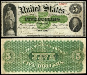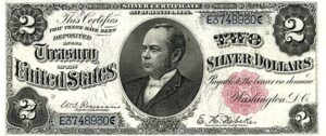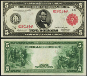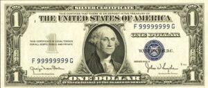
📷 Image source: Wikimedia Commons. Images are selected by AI to represent the article topic and may not depict the exact note(s) described.
Pull an 1890 Treasury Note from its holder and flip it over. What you see on the reverse is unlike anything else in American numismatic history: a dense, almost overwhelming field of mechanically engraved rosette patterns, interlocking scrollwork, and enormous numeral counters so dominant they seem to pulse off the paper. These are the so-called Jewel Backs, and among collectors who specialize in large-size currency, they occupy a category entirely their own. No other series produced by the Bureau of Engraving and Printing before or after achieved quite the same fusion of technical bravado and sheer ornamental ambition.
The Sherman Silver Purchase Act and the Birth of Treasury Notes
To understand why the 1890 Treasury Notes exist at all, you have to start with politics. The Sherman Silver Purchase Act of July 14, 1890 required the federal government to purchase 4.5 million ounces of silver per month, paying for it with a new class of paper currency: Treasury Notes, sometimes called Coin Notes because they were redeemable in either gold or silver coin at the Treasury’s discretion. These were not Legal Tender Notes, Silver Certificates, or National Bank Notes. They occupied their own legal category, and the BEP designers apparently felt the occasion deserved something visually extraordinary.
The notes were issued in denominations of $1, $2, $5, $10, $20, $50, $100, and $1,000. Signature combinations on the 1890 series are limited to Rosecrans-Nebeker, reflecting the brief window during which these particular back designs were used before the 1891 series replaced the elaborate reverses with somewhat simpler layouts. That design change is the defining distinction between the two series and the reason 1890 notes command such premium prices.
What Is Guilloche, and Why Did the BEP Use It?
Guilloche is a geometric ornamental technique in which two or more continuous curved lines interweave to form a repeating, symmetrical pattern. The word derives from the French, and the technique itself predates paper currency by centuries, appearing in ancient Greek and Roman architectural friezes. By the 19th century, it had been adapted into mechanical rose engines, lathes capable of cutting extraordinarily precise repeating curves into steel engraving dies. The Swiss watchmaking industry used similar machinery to decorate watch movements. The BEP used it to defeat counterfeiters.
The logic was straightforward: a precisely engineered guilloche pattern, engraved into a master die by a geometric lathe, could not be reproduced accurately by hand. The lines were too fine, too perfectly spaced, and too mathematically consistent. Any attempt at hand-engraved imitation would reveal irregularities under magnification. This security function had driven the BEP and its predecessor, private bank note companies like the American Bank Note Company and the National Bank Note Company, to invest heavily in rose engine technology throughout the middle decades of the 19th century.
When examining an 1890 Treasury Note under a loupe, focus on the guilloche rosettes in the corners of the reverse. Genuine notes will show razor-sharp, perfectly consistent line spacing throughout. Any wavering or thickening of lines in those rosette fields is a strong indicator of a photomechanical reproduction or altered note.
On the 1890 Treasury Note reverses, the BEP designers did not use guilloche merely as a background element. They made it the entire architectural logic of the design. The reverses are essentially a master class in late 19th-century geometric engraving, with every square centimeter of the note surface occupied by some form of lathe-turned or hand-engraved ornament.
The Denomination Counters: Tombstones in Green Ink
The most immediately striking feature of the 1890 reverse designs is the denomination counter, a large numeral panel that dominates the center of the note. On the $1, this counter is relatively restrained, but by the time you reach the $5, $10, $20, and especially the $50 and $100, the counters become massive architectural forms. The numeral is set within an ornate frame of scrollwork and lathe-work that fills nearly the full height of the note. The visual weight of these counters is so substantial, and their shape so reminiscent of a tombstone or memorial tablet, that collectors long ago began calling these notes Tombstone Notes. The nickname stuck, and today it is used interchangeably with Jewel Backs depending on whether the speaker is emphasizing the counter shape or the overall ornamental richness.
The counters serve the same anti-counterfeiting function as the guilloche rosettes. The precise geometric curves of the numeral frames, combined with the fine lathe-work filling the interior of each counter panel, created a density of engraved line work that defeated any reproduction technology available in the 1890s. The BEP’s master engravers worked from geometrically plotted designs, and the resulting dies contained engraved lines measuring as little as two thousandths of an inch apart in the most intricate sections.
Reading the Filigree: A Denomination-by-Denomination Tour
The $1 1890 Treasury Note, signed by Rosecrans and Nebeker, features a portrait of Edwin M. Stanton on the obverse. The reverse centers on a bold numeral ONE counter flanked by two large lathe-work rosettes. The green ink used on the reverse was a Bureau formula designed to resist chemical alteration, and its slightly different tone from the standard green used on other series gives the Jewel Backs a distinctive olive-rich color that experienced collectors recognize immediately.
The $2 note carries a portrait of General James McPherson on the obverse. The reverse displays the TWO counter with an especially dense surround of interlocking scroll filigree that rewards close examination. Many collectors consider the $2 to have the most balanced reverse composition of the lower denominations.
The $5 note, bearing General George Henry Thomas on the obverse, steps up the visual intensity considerably. The FIVE counter on the reverse is large enough to occupy roughly a third of the note’s total area. The lathe-work rosettes flanking it are correspondingly larger and more complex than those on the $1 or $2.
The $1 and $2 denominations are by far the most affordable entry points into the 1890 Treasury Note series. Fine examples can sometimes be found in the $400 to $900 range at auction, while the same grades in $50 or $100 denominations require five-figure budgets. Building a denomination set starting from the bottom is a practical strategy for assembling a complete type set over several years.
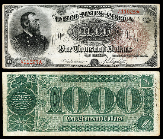
The $50 and $100 denominations are where the design reaches its fullest expression. The $50 note, with William Henry Seward on the obverse, and the $100, with Admiral David Farragut, both feature reverses where the denomination counter is so large and so ornately framed that the engraved rosette fields surrounding it are almost incidental by comparison. These are among the most visually impressive notes in all of large-size currency, and they are also among the rarest in collectible grades. The $1,000 Treasury Note of 1890 is in a class by itself: fewer than ten examples are documented as surviving, making it one of the rarest notes in American numismatics regardless of series or type.
The 1890 to 1891 Transition: Why the Jewel Backs Were Abandoned
The 1891 series Treasury Notes retained the same obverse portraits as the 1890 series but replaced the elaborate Jewel Back reverses with significantly simpler designs. The reason most commonly cited is that the densely engraved reverses were difficult and expensive to print with consistent quality. The fine lathe-work demanded precise ink viscosity and impression pressure, and notes with any variation in printing often showed inconsistent ink fill in the finest guilloche lines. The BEP’s management concluded that a cleaner, less complex reverse design would be more economical to produce and would maintain more consistent quality across large print runs.
From a collector’s standpoint, this decision was fortunate. It means the 1890 series stands alone as the only American currency to carry the full Jewel Back treatment. The 1891 notes are collectible in their own right, particularly the higher denominations and certain rare signature combinations, but they lack the visual drama that defines the earlier series.
When comparing an 1890 to an 1891 Treasury Note side by side, the back design difference is immediately apparent even without a loupe. The 1890 reverse fills every available space with engraved ornament, while the 1891 reverse feels comparatively open and simple. This visual distinction makes the two series easy to differentiate even for relatively new collectors.
Grading Considerations Specific to Jewel Backs
Grading 1890 Treasury Notes requires particular attention to the reverse, not just the obverse, which is the default focus for most large-size notes. The dense guilloche fields on the reverse are extremely sensitive to handling. Even light contact with fingers or other surfaces can deposit oils or create minute abrasions that dull the sharpness of the engraved lines. A note with a technically Choice Fine (F-15) obverse can sometimes grade lower overall because the reverse guilloche shows more wear than the portrait side would suggest.
Paper quality matters enormously for these notes. The BEP used high-quality fiber paper for the series, and surviving examples often show good paper body even when the surfaces have been circulated. Notes with strong paper, original crispness, and well-centered printing command substantial premiums over technically equivalent but softer-papared examples. PCGS Currency and PMG both grade these notes, and for high-value denominations, third-party grading is essentially mandatory for serious transactions.
Color is another grading variable unique to the Jewel Backs. The brown Treasury seal and the distinctive green reverse ink can both fade with age and improper storage. Original, unfaded color on a circulated note is a significant positive attribute. Notes that have been stored in acidic environments, or that show evidence of cleaning or pressing, will have their grades reduced accordingly by major grading services.
Storage in Mylar holders rather than PVC-based plastics is critical for 1890 Treasury Notes. PVC off-gasses over time and can react with the ink chemistry on these notes, causing color migration and surface damage that permanently reduces grade and value. For long-term storage, archival-quality holders and stable temperature and humidity are non-negotiable.
| Series / Denomination | Signature Combination | Known Population (approx.) | Rarity |
|---|---|---|---|
| 1890 $1 | Rosecrans-Nebeker | Several hundred | Scarce |
| 1890 $2 | Rosecrans-Nebeker | 150-200 known | Scarce |
| 1890 $5 | Rosecrans-Nebeker | 200-300 known | Scarce |
| 1890 $10 | Rosecrans-Nebeker | 100-150 known | Rare |
| 1890 $20 | Rosecrans-Nebeker | 75-100 known | Rare |
| 1890 $50 | Rosecrans-Nebeker | Fewer than 30 known | Key Date |
| 1890 $100 | Rosecrans-Nebeker | Fewer than 25 known | Key Date |
| 1890 $1,000 | Rosecrans-Nebeker | Fewer than 10 known | Key Date |
| 1891 $1 (comparison) | Rosecrans-Nebeker / Tillman-Morgan | 500+ known | Common |
| 1891 $1,000 | Rosecrans-Nebeker | Fewer than 5 known | Key Date |
The Legacy of the Jewel Backs in American Design History
The 1890 Treasury Notes represent a specific philosophy of currency design: the idea that a banknote should be beautiful enough that no one would want to destroy it, and complex enough that no one could successfully reproduce it. These two goals, aesthetic and security-driven, reinforced each other perfectly in the Jewel Backs. The BEP designers of the late 19th century were working at the intersection of industrial technology and fine art engraving, and in the 1890 series they produced something that still commands admiration more than 130 years later.
For collectors, these notes are not merely old paper money. They are documentation of a peak moment in American engraving craft, produced by artisans whose names are largely lost to history but whose work survives in the sharp green lines of every surviving Jewel Back. Adding even a single well-preserved example to a collection is to hold something genuinely irreplaceable, a note that could not be made today by any economically practical means, and that was made the way it was made because a group of designers and engravers at the Bureau of Engraving and Printing decided, at least once, to make American currency as beautiful as it could possibly be.