📷 Image source: eBay. Images are selected by AI to represent the article topic and may not depict the exact note(s) described.
Flip over any Federal Reserve Note and look carefully. You will find Latin phrases, Roman numerals, and architectural engravings drawn directly from the classical tradition. This was no accident. From the earliest Demand Notes of 1861 through the high-engraving era of the late nineteenth century and into the modern small-size notes standardized in 1929, the Bureau of Engraving and Printing and its predecessor currency producers made deliberate, calculated choices to embed the visual grammar of ancient Rome into American paper money. The result is a numismatic record of one nation’s sustained effort to borrow authority from antiquity.
The Classical Tradition in American Public Life
To understand why Roman numerals and Latin text appear on currency, you have to situate the founding generation’s cultural obsession with the ancient world. The Founders were products of a classical education. Thomas Jefferson designed Monticello and the Virginia State Capitol in the Roman temple style. Benjamin Franklin could quote Cicero. Alexander Hamilton, whose face now graces the $10 note, wrote essays under the pseudonym “Publius” when co-authoring the Federalist Papers, a direct reference to Publius Valerius Publicola, one of Rome’s first consuls after the expulsion of the kings.
This neoclassical orientation shaped the visual identity of the republic from its first years. When Charles Thomson and William Barton finalized the Great Seal of the United States in 1782, they loaded it with Roman-derived symbolism: the eagle clutching thirteen arrows and an olive branch, the Eye of Providence above an unfinished pyramid, and two Latin mottos. These mottos, “Annuit Coeptis” and “Novus Ordo Seclorum,” came directly from Virgil. The first is adapted from the Aeneid (“He has favored our undertakings”) and the second from the Fourth Eclogue (“A new order of the ages”). Both appeared on the reverse of the Great Seal and, eventually, on the reverse of the Federal Reserve Note $1 bill starting with the Series 1935A silver certificates that first displayed the full Great Seal reverse.
Roman Numerals as Encoded Date and Design Language
The most immediately visible Roman numeral on modern American currency is MDCCLXXVI, engraved at the base of the unfinished pyramid on the reverse of the $1 Federal Reserve Note. The number translates as 1776, the year of independence. Its placement is not merely decorative. The pyramid’s thirteen courses of stone represent the original thirteen colonies, and the Roman numeral date at its foundation asserts that the republic’s authority was founded at a specific, historically knowable moment. In contrast to monarchies whose legitimacy derived from hereditary continuity stretching back into obscurity, the American republic claimed a dated, rational origin.
When examining Series 1935A silver certificates, note that this was the first $1 denomination to display both the obverse and reverse of the Great Seal simultaneously. Earlier $1 silver certificates, including the ornate Series 1899 “Black Eagle” and the Series 1923 “Porthole” note, used completely different reversal designs without the pyramid imagery. A well-centered 1899 Black Eagle in Fine-12 or better is a spectacular example of pre-pyramid $1 design and remains highly collectible.
Large-size notes from the National Bank Note era (1863 to 1929) also used Roman numeral dating conventions on series designations and occasionally in the border ornamentation. Skilled engravers at the Continental Bank Note Company and later the BEP treated Latin letterforms as a signal of seriousness. The serif-heavy typefaces used on nineteenth-century currency were themselves derived from Roman monumental inscriptions, the kind carved into triumphal arches and temple friezes. Type designers in the eighteenth and nineteenth centuries studied the proportions of letters on Trajan’s Column in Rome, and those proportions echoed directly into engraved banknote lettering.
Treasury Seals and the Latin Vocabulary of Trust
The Treasury seal that appears on United States Notes, Silver Certificates, and Federal Reserve Notes has gone through several design iterations, but it has consistently incorporated Latin text. The phrase “Thesauri Americae Septentrionalis Sigillum” translates as “The Seal of the Treasury of North America.” This Latin inscription appeared on seals used from the earliest federal issues and signals something deliberate: by using a dead language associated with legal, ecclesiastical, and governmental authority throughout European history, the Treasury communicated that it was operating within a tradition of stable institutions rather than improvising.
The color of the Treasury seal varied meaningfully across currency types, and collectors track these variations closely. United States Notes (Legal Tender Notes) carried red seals. Silver Certificates carried blue seals. Federal Reserve Bank Notes from the 1915 and 1918 series carried blue seals. Federal Reserve Notes carried green seals from their inception with the Federal Reserve Act of 1913. Gold Certificates used gold seals. The Latin text on all these seals remained consistent even as seal colors changed, maintaining a thread of classical continuity across the entire spectrum of federal paper money.
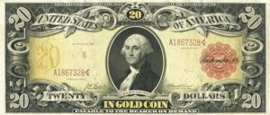
The Treasury seal underwent a subtle but important redesign between large-size and small-size formats. On small-size notes beginning in 1929, the seal became more compact and the Latin lettering slightly more regularized. Comparing a large-size 1922 $1 Gold Certificate (with its bold, ornate gold seal) against a small-size 1928 $20 Federal Reserve Note under magnification reveals just how much visual weight the engravers sacrificed when the notes shrank. The large-size seals, with their elaborate Latin lettering and heavy crosshatching, are masterworks of intaglio engraving.
“E Pluribus Unum” and the Numismatic Record of a Motto
“E Pluribus Unum,” Latin for “Out of many, one,” has appeared on American coins since the 1790s and migrated to paper currency design through the Great Seal. The phrase is visible on Federal Reserve Note faces wherever the eagle from the Great Seal appears, most notably on the $1 bill’s obverse, where the eagle clutching the shield and ribboned banner displays the motto on the scroll in its beak.
The phrase itself has an interesting classical pedigree. It is often attributed to the Roman poet Virgil, but the more direct source is a Latin poem called “Moretum,” about the making of a salad, in which the phrase describes many ingredients blending into one dish. The Founders would have appreciated the irony of a description of culinary mixing becoming the motto for national political union. Regardless of its humble agricultural origin, on American paper money the phrase carries the full weight of its federal context, and its Latin rendering signals that the union claims the same transhistorical legitimacy as Roman law.
Architectural Engraving and Classical Buildings as Currency Design
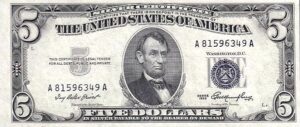
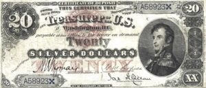
Roman numerals and Latin phrases are only part of the classical story on US currency. The buildings depicted on Federal Reserve Notes are themselves statements about the classical tradition. The Lincoln Memorial on the $5 note is a Greek temple design. The Treasury Building on the $10 note features a Greek Revival colonnade. Monticello on the $2 note, Jefferson’s home, was modeled directly on the Villa Rotonda by Palladio, which was itself inspired by the Roman Pantheon. The White House on the $20 note incorporates neoclassical elements drawn from Irish and English Palladian architecture, which traced its lineage back through Renaissance Italy to Rome.
Even the Independence Hall depicted on the $100 note, while Georgian rather than strictly Roman in style, belongs to a broader classical vocabulary that the engravers of the BEP consistently rendered in fine-line intaglio that emphasized permanence and sculptural weight. The engraving technique itself, forcing ink-laden metal into paper under enormous pressure to produce a tactile, raised image, was chosen in part because it most closely approximated the solidity of carved stone. You can feel classical authority when you run your fingertip across the portrait on a high-grade Federal Reserve Note.
Intaglio printing quality is one of the most reliable guides to counterfeit detection and also to the condition of a genuine note. On a well-preserved note in Extremely Fine-40 or better, the fine lines of architectural engraving on buildings like the Lincoln Memorial ($5) or Independence Hall ($100) should be crisp, distinct, and slightly raised to the touch. A flat, smooth feel to the portrait or building engraving on an older note is a strong indicator of heavy circulation or, in some cases, a washed and pressed note, which significantly affects value.
Series Dates, Act Dates, and the Roman Calendar Consciousness
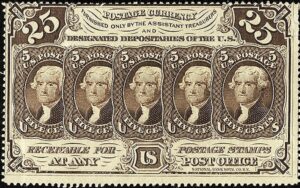
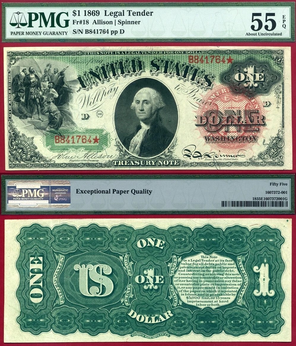
One underappreciated aspect of classical influence on currency is the way series dating and act dating on large-size notes mimicked the Roman legal tradition of citing specific legislative years. Large-size notes often carried two dates: a series date indicating the design authorization and, in smaller print, the act date referencing the congressional legislation that authorized the currency type. United States Notes of the Series 1869 “Rainbow Note” design, for instance, carry visual references to specific Acts of Congress in a format that recalls Roman legal documents citing their Senate authorizations.
The Series 1869 $1 United States Note, sometimes called the “Rainbow Note” for its polychrome design, is one of the most visually dramatic examples of this period. With its large red Treasury seal, complex lathe-work border, and the portrait of Columbus on the reverse (a nod to discovery mythology rather than strictly Roman imagery, but within the same tradition of classical historical reference), it illustrates how the BEP’s engravers treated each note as a miniature civic monument.
The Pyramid and Its Masonic-Roman Intersection
No discussion of classical symbolism on US currency can ignore the unfinished pyramid on the $1 note reverse. Pyramids are Egyptian, not Roman, but they entered the American currency tradition through a specific historical filter: the Enlightenment interest in ancient civilizations and the Masonic symbolic vocabulary that many of the Founders shared. By 1782, when the Great Seal was finalized, the pyramid had passed through Roman artistic appropriation (Rome built obelisks and studied Egyptian monuments extensively), Renaissance Hermeticism, and Freemasonry before arriving at Charles Thomson’s desk.
What makes the pyramid on the dollar bill specifically Roman in its numismatic expression is the Roman numeral date at its base and the Latin mottoes that frame it above and below. The Eye of Providence floating above the pyramid, labeled “Annuit Coeptis” above and “Novus Ordo Seclorum” below, is a composition that could have appeared on a Roman triumphal monument. The BEP engravers who rendered this imagery for the Series 1935A silver certificate gave it the same gravitas and crisp line-work they brought to portraits and architectural subjects, treating it as seriously as any numismatic subject deserved.
| Series / Date | Denomination and Type | Key Classical Feature | Rarity |
|---|---|---|---|
| 1869 | $1 United States Note (Rainbow) | Polychrome lathe-work, red seal Latin text | Rare |
| 1880 | $1 United States Note (Large Red Seal) | Revised Treasury seal with full Latin inscription | Scarce |
| 1899 | $1 Silver Certificate (Black Eagle) | Eagle vignette with E Pluribus Unum banner | Scarce |
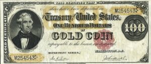
| 1922 | $1 Gold Certificate | Gold Treasury seal with Latin motto, Roman numerals | Scarce |
| 1928 | $20 Federal Reserve Note (Small-Size First Year) | First small-size Green Seal, condensed Latin text | Common |
| 1935A | $1 Silver Certificate | First appearance of full Great Seal reverse with MDCCLXXVI | Common |
| 1935A (R and S) | $1 Silver Certificate Experimental | Experimental “R” and “S” suffix series, same classical reverse | Key Date |
| 1963A | $1 Federal Reserve Note (First Year) | Transition from Silver Certificate, retained Great Seal reverse | Common |
| 1966 | $100 United States Note (Red Seal) | Last large-denomination Legal Tender with red seal Latin text | Scarce |
What Classical Design Tells Modern Collectors
For today’s collector, the classical elements on US currency are more than decorative. They are a dating mechanism, a design hierarchy indicator, and a guide to authentication. Notes with the most elaborate classical lettering and Roman-style engraving tend to be earlier issues, since the BEP progressively simplified designs across the twentieth century for reasons of cost and security feature accommodation. A large-size Legal Tender Note from the 1880s or 1890s with its dense, classically proportioned engraving represents the high-water mark of this tradition.
Grading these notes for the quality of their engraved detail has become something of an art form within the hobby. The Paper Money Guaranty (PMG) and Professional Currency Grading Service (PCGS Currency) standards both implicitly value the preservation of fine engraved lines, which on classical-influenced notes means that the Latin letterforms in seals, the numerals in borders, and the architectural line-work on building vignettes must remain clear and sharp for a note to grade above Very Fine-30. A note that has been cleaned or pressed will often show smearing or filling of exactly these fine Latin-letter details under magnification, dropping it into lower grades regardless of its surface appearance.
The Bureau of Engraving and Printing understood something that modern branding experts still recognize: authority is partly a matter of aesthetic pedigree. By grounding American paper money in the visual language of Rome, by inscribing Latin phrases, carving Roman numerals into the base of national symbols, and rendering portraits and buildings with the gravity of stone monuments, the BEP made every note a small argument for the permanence and legitimacy of the republic. That argument is still being made every time a $1 bill changes hands, and it is one of the most compelling reasons to look more closely at the currency in your pocket, your album, and your collection.